Bureaucrat Conrad, you are technically correct - the best kind of correct. I hereby promote you to grade 37. - Number 1.0 (Futurama, S2E15)
I won't lie to you, Neo. Every single man or woman who has fought an agent has died. But where they have failed, you will succeed.
Why?
I've seen an agent punch through a concrete wall; men have emptied entire clips at them and hit nothing but air; yet, their strength, and their speed, are still based in a world that is built on rules. Because of that, they will never be as strong, or as fast, as you can be.
What are you trying to tell me? That I can dodge bullets?
No, Neo. I'm trying to tell you that when you're ready ... you won't have to.
- Morpheus (The Matrix, 1999)
CSS, like the Matrix, is a system based on rules.
I wrote this set of chapters to describe those rules. It's long-form writing, but not book-length. I don't think I'd want to write a full book about CSS, but writing about CSS layout has been useful. My approach is pedantic:
pedantic: adjective. (2): overly concerned with minute details or formalisms, especially in teaching.
I mean it in a good way, though obviously the word has a negative connotation. Is technically correct the best kind of correct? No, it's not. But for this topic, there are enough resources that aren't technically correct.
You may have heard that there are inline and block elements in CSS normal flow. But did you know that in CSS, the relative positioning of block and inline elements is not actually determined by the element's display property? It's actually determined by the formatting context, which is influenced by the siblings of the element.
You may have used z-index to "fix" the relative stacking order of content. But did you know that z-index is not absolute across the document, but rather relative to a stacking context?
You may have heard about the box model. But did you know that there are in fact at least five different box models, with subtle differences in how content dimensions and margin: auto are treated? You will, if you read this.
This is a set of chapters about CSS layout for people who already know CSS. Which seems like a small market, I admit. I took a look around for good resources for learning CSS layout, but I found that most of them weren't pedantic enough.
CSS layout can be difficult to learn, because websites usually evolve incrementally. This means that you end up learning small tips and tricks here and there, and never learn the underlying layout algorithm.
This set of chapters walks you through every major concept in CSS layout, and includes dozens of applied examples that illustrate the various concepts.
Chapter 1: Box positioning in CSS covers how the boxes that HTML elements generate are positioned relative to each other:
- the three main positioning schemes in CSS: normal flow, floats and absolute positioning
- normal flow concepts, such as anonymous box generation, formatting context, line boxes and alignment within line boxes
- float concepts, such as float order, clearfix and float interactions with parent height
Chapter 2: Box sizing in CSS discusses the box model, but more importantly how the box model varies across the different positioning schemes in CSS. Concretely, height, width and margins are calculated using completely different mechanisms, and you can only understand these calculations by knowing the positioning scheme and calculation mechanism in use.
Chapter 3: Additional properties that influence positioning covers additional mechanisms that influence box positioning, such as:
- margin collapsing
- negative margins
- overflow
- max-width, max-height, min-width, min-height
- stacking contexts and the z-index property
- how pseudo elements impact layout
- the CSS3 box-sizing property
Chapter 4: Flexbox discusses the CSS 3 flexbox layout mode.
Chapter 5: CSS layout - tricks and layout techniques takes what we have learned and applies it to several practical problems. It also contains small quiz-like questions to test you understanding of layout in contexts such as:
- horizontal and vertical centering
- how CSS grid frameworks work
- multicolumn layout
- common gotchas and layout tricks.
If you need to lookup a specific concept or property, take a look at the reference index which provides an easy way to find the right chapter and section across the set of chapters.
1. Box positioning in CSS
At the core, CSS layout is about mapping a set of HTML elements to a set of rectangular boxes that can be positioned on the x-, y- and z-axis.
The x- and y-axis positioning of these boxes is determined by the positioning scheme that is applied to the boxes. In this chapter, I will cover the positioning schemes introduced in CSS 2.1: normal flow, floats and absolute positioning.
Conceptually, the highest level abstraction for CSS layout is the positioning scheme. Once a positioning scheme has been determined, it can be further modified by specific layout modes, such as display: table or display: inline-table. Even the CSS 3 extensions - which introduced layout modes such as flexbox and grid - still exist within one of the main positioning schemes (e.g. display: flex vs. display: inline-flex).
Positioning schemes
CSS 2.1 defines three positioning schemes, which are:
- normal flow, which consists of three formatting contexts: the block, inline and relative formatting contexts
- floats, which interact with normal flow in their own way and form the basis of most modern CSS grid frameworks
- absolute positioning, which deals with absolute and fixed elements relative to the normal flow
The positioning scheme has a great deal of impact on the x and y-axis positioning of elements. Section 9.3 of the CSS 2.1 spec describes the interactions between these three properties, but the short version is all elements belong to the normal flow by default unless they are specifically removed from normal flow - typically by setting the float property or the position property.
| Attribute | Default value | Purpose |
|---|---|---|
| display | block or inline | Determines the layout algorithm to use |
| position | static | Controls the positioning of the element |
| float | none | Allows other elements to float around the element |
Both floats and absolute positioning can be best understood through how they interact with the normal flow, so I will cover the normal flow positioning scheme first.
If you think about it, there are actually two aspects of layout that are at play:
- how the box of an element is sized and aligned, which is primarily controlled by the
displayproperty (andwidth,heightandmargin). - how elements within a particular parent element are positioned relative to each other
In this chapter, I'll focus on the latter aspect - relative positioning. The next chapter covers the box model, which determines alignment and sizing.
The relative positioning of elements within a parent element is controlled by the formatting context established for all immediate child elements of a particular parent element, which in normal flow can be either a block or inline formatting context.
Here's what the CSS 2.1 spec says about formatting context:
Boxes in the normal flow belong to a formatting context, which may be block or inline, but not both simultaneously. Block-level boxes participate in a block formatting context. Inline-level boxes participate in an inline formatting context. Source
The parent (container) establishes the formatting context for its children based on whether the child boxes are considered to be inline-level or block-level. The terms inline-level and block-level are defined to highlight that blocks with a display property other than inline or block will still map to one of the two formatting contexts within normal flow. For example, display: table elements are considered to be block-level and display: inline-table elements are considered to be inline-level.
A block-level element is defined as:
Block-level elements are those elements of the source document that are formatted visually as blocks (e.g., paragraphs). The following values of the 'display' property make an element block-level: 'block', 'list-item', and 'table'.
Block-level boxes are boxes that participate in a block formatting context. Each block-level element generates a principal block-level box that contains descendant boxes and generated content and is also the box involved in any positioning scheme. Some block-level elements may generate additional boxes in addition to the principal box [for example,]: 'list-item' elements. These additional boxes are placed with respect to the principal box.
Almost all block-level boxes are also block container boxes. A block container box is simply a parent for a set of other boxes and has a specific formatting context:
Except for table boxes [...] and replaced elements, a block-level box is also a block container box. A block container box either contains only block-level boxes or establishes an inline formatting context and thus contains only inline-level boxes. Source
And an inline-level element is defined as:
Inline-level elements are those elements of the source document that do not form new blocks of content; the content is distributed in lines (e.g., emphasized pieces of text within a paragraph, inline images, etc.). The following values of the 'display' property make an element inline-level: 'inline', 'inline-table', and 'inline-block'. Inline-level elements generate inline-level boxes, which are boxes that participate in an inline formatting context.
An inline box is one that is both inline-level and whose contents participate in its containing inline formatting context. A non-replaced element with a 'display' value of 'inline' generates an inline box. Inline-level boxes that are not inline boxes (such as replaced inline-level elements, inline-block elements, and inline-table elements) are called atomic inline-level boxes because they participate in their inline formatting context as a single opaque box. Source
I won't really talk about replaced vs non-replaced elements, since it is a fairly minor distinction. The easiest way to think about replaced elements is to think about an img or video element - that is, an element that simply has a single (externally defined) content that cannot be broken up into lines like text content can.
You can roughly think of the two formatting contexts in normal flow to correspond to vertical stacking (when in a block formatting context) and horizontal stacking (when in an inline formatting context). I'll cover both in a moment.
The interesting thing about the definitions above is that the formatting context of every box must either be "inline formatting context" or "block formatting context". That is, all child elements are laid out using one type of formatting context for each parent element. How can this be, when you can clearly mix block-level content like divs and inline-level content such as text? The answer is that there is a mechanism by which inline-level elements can be promoted to block-level elements. This mechanism is known as anonymous box generation.
Anonymous box generation
Anonymous box generation is used to deal with cases where a parent element contains a mixture of inline-level and block-level child elements (in which case "anonymous block boxes" are generated) and with cases where the markup contains inline-level elements mixed with surrounding text (in which case "anonymous inline boxes" are generated), such as an em or i tag inside a paragraph of text.
Anonymous block boxes
The spec gives an example of anonymous block box generation:
<div>
    Some text
    <p>More text
</p></div>
And states that:
if a block container box (such as that generated for the DIV above) has a block-level box inside it (such as the P above), then we force it to have only block-level boxes inside it.
For example, the spec provides the following illustration of how the example code results in anonymous boxes that wrap the inline-level content:
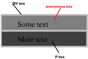
When an inline box contains an in-flow block-level box, the inline box (and its inline ancestors within the same line box) are broken around the block-level box (and any block-level siblings that are consecutive or separated only by collapsible whitespace and/or out-of-flow elements), splitting the inline box into two boxes (even if either side is empty), one on each side of the block-level box(es). The line boxes before the break and after the break are enclosed in anonymous block boxes, and the block-level box becomes a sibling of those anonymous boxes. When such an inline box is affected by relative positioning, any resulting translation also affects the block-level box contained in the inline box.
In short, when inline-level and block-level boxes are mixed in a single parent element, the inline-level boxes are broken around the block-level box and the inline-level box content is enclosed in an anonymous block-level box.
Anonymous inline boxes
Anonymous inline boxes are generated when a block container element contains text that is not enclosed within an inline-level element. For example, the markup:
<p>Some <em>emphasized</em> text</p>would result in two anonymous inline boxes: one for "Some " and one for " text".
Anonymous box generation is important, because it determines what the formatting context is for elements in normal flow that have both block- and inline-level siblings. Many real-world HTML layouts will have both block- and inline-level content in a single parent element. Anonymous box generation ensures that if any block-level content is mixed in with inline-level siblings, then the inline-level boxes are wrapped in anonymous block-level containers for purposes of layout, which means that they are laid out relative to other boxes as if they were block-level boxes.
Now that we know how the formatting context is determined, let's look at how layout is performed.
Normal flow positioning
In normal flow, the boxes (elements) contained in a particular parent box are laid out based on the formatting context. The two formatting contexts in normal flow roughly correspond to vertical stacking and horizontal stacking.
Normal flow: block formatting
The spec provides a very nice description of how layout works in a block formatting context:
In a block formatting context, boxes are laid out one after the other, vertically, beginning at the top of a containing block. The vertical distance between two sibling boxes is determined by the 'margin' properties. Vertical margins between adjacent block-level boxes in a block formatting context collapse.
In a block formatting context, each box's left outer edge touches the left edge of the containing block (for right-to-left formatting, right edges touch). This is true even in the presence of floats (although a box's line boxes may shrink due to the floats), unless the box establishes a new block formatting context (in which case the box itself may become narrower due to the floats). source
The two most important takeaways are that in a box formatting context, boxes are laid out vertically, and that every box's left outer edge will touch the left outer edge of the containing block (even in the presence of floats).
The code example below illustrates some of these rules:
.float {
  float: left;
}
.foo {
  padding-top: 10px;
}
.bar {
  width: 30%;
}
.baz {
  width: 40%;
}
<div class="container violet">
  <div class="float red">float</div>
  <div class="foo blue">foo</div>
  <div class="bar green">bar</div>
  <div class="baz orange">baz</div>
</div>
In the example above:
- every block box is on the left outer edge of the containing block
- the presence of a float does not influence the position of the left outer edge (per spec) in any way, except to offset the text
- the block box
foo(which has no width set) expands to the full container width - the two other boxes, which have set widths extend from the left edge of the container
- the two other boxes are not moved around in any way, even though they would for example fit on a single row
Overall, the block formatting context is quite regular - it can be described with a couple of paragraphs. However, this is not the case for the inline formatting context.
Normal flow: inline formatting
The inline formatting context is a bit more complicated, as it involves dividing the content onto line boxes, another construct that is not directly visible in the markup but instead generated based on laying out the content:
In an inline formatting context, boxes are laid out horizontally, one after the other, beginning at the top of a containing block. Horizontal margins, borders, and padding are respected between these boxes.
The boxes may be aligned vertically in different ways: their bottoms or tops may be aligned, or the baselines of text within them may be aligned. The rectangular area that contains the boxes that form a line is called a line box. source
The width of a line box is determined by a containing block and the presence of floats. The height of a line box is determined by the rules given in the section on line height calculations.
In short, within an inline formatting context boxes are laid out horizontally onto one or more line boxes. Line boxes are generated as needed; their width is generally the width of the containing block (minus floats) and their height is always sufficient for all the boxes it contains. Specifically:
A line box is always tall enough for all of the boxes it contains. [...] When several inline-level boxes cannot fit horizontally within a single line box, they are distributed among two or more vertically-stacked line boxes. Thus, a paragraph is a vertical stack of line boxes. Line boxes are stacked with no vertical separation (except as specified elsewhere) and they never overlap.
In general, the left edge of a line box touches the left edge of its containing block and the right edge touches the right edge of its containing block. [Line boxes] may vary in width if available horizontal space is reduced due to floats. Line boxes in the same inline formatting context generally vary in height (e.g., one line might contain a tall image while the others contain only text).
What happens when an inline box is too large for a line box? It depends on whether the inline box is replaced (e.g. a video or an image) or non-replaced (text etc.):
When an inline box exceeds the width of a line box, it is split into several boxes and these boxes are distributed across several line boxes. If an inline box cannot be split [...], then the inline box overflows the line box.
When an inline box is split, margins, borders, and padding have no visual effect where the split occurs (or at any split, when there are several).
In other words, when inline boxes exceed the width of a line box, it will be split if possible. When the rules disallow splitting the box, it will simply horizontally overflow the line box.
Perhaps the most complicated aspect of the inline formatting context is how alignment works within line boxes. Two properties: text-align and vertical-align control the alignment.
Horizontal alignment within line boxes: text-align
The text-align property controls how inline-level boxes are positioned on a line box.
| Property | Default value | Purpose |
|---|---|---|
| text-align | a nameless value that acts as 'left' if 'direction' is 'ltr', 'right' if 'direction' is 'rtl' | Describes how inline-level content of a block container is aligned. |
Note that it only applies when the line box contains some unused space, and that you cannot directly control how inline-level content is placed on line boxes. The spec states:
When the total width of the inline-level boxes on a line is less than the width of the line box containing them, their horizontal distribution within the line box is determined by the 'text-align' property. If that property has the value 'justify', the user agent may stretch spaces and words in inline boxes (but not inline-table and inline-block boxes) as well. source
In other words, the text-align property is applied after the inline content has been distributed across line boxes.
A block of text is a stack of line boxes. In the case of 'left', 'right' and 'center', this property specifies how the inline-level boxes within each line box align with respect to the line box's left and right sides; alignment is not with respect to the viewport. In the case of 'justify', this property specifies that the inline-level boxes are to be made flush with both sides of the line box if possible, by expanding or contracting the contents of inline boxes, else aligned as for the initial value. (See also 'letter-spacing' and 'word-spacing'.) source
Normally, whitespace (spaces, tabs etc.) can be affected by justification. However:
If an element has a computed value for 'white-space' of 'pre' or 'pre-wrap', then neither the glyphs of that element's text content nor its white space may be altered for the purpose of justification.
Vertical alignment within line boxes: vertical-align
The following two properties control vertical alignment within line boxes:
| Property | Default value | Purpose |
|---|---|---|
| vertical-align | baseline | Controls the vertical alignment of boxes. Only applies to inline (and table-cell) boxes. |
| line-height | normal (~1.2 times font height) | Specifies the height that is used to calculate line box height. |
vertical-align controls the vertical alignment of inline boxes within line boxes - not the vertical alignment of the line boxes themselves. Of course, to understand how inline boxes are positioned you also need to know how height is calculated both for the line box as well as the inline boxes themselves.
The line box height is determined by two factors:
- the height of the inline boxes contained within it
- the alignment of the inline boxes contained within it
The height of (non-replaced) inline boxes is defined as follows (source):
The 'height' property does not apply. The height of the content area should be based on the font, but this specification does not specify how. A UA may, e.g., use the em-box or the maximum ascender and descender of the font. [...]
The vertical padding, border and margin of an inline, non-replaced box start at the top and bottom of the content area, and has nothing to do with the 'line-height'. But only the 'line-height' is used when calculating the height of the line box.
As you can see from the parts of the spec shown above, the height of inline boxes is determined by their font and their line height. Specifically, each font must define a baseline, a text-top edge and a text-bottom edge. The calculated height of the content area of an inline box is the height of the font (e.g. bottom - top) multiplied by the line-height value:
On a non-replaced inline element, 'line-height' specifies the height that is used in the calculation of the line box height.
line-height can be specified relative to the font height, or it can be set to an absolute length value, in which case the font height is no longer involved in calculating the height of the inline box. It is not at all related to the height of the parent element, even when specified as a percentage.
line-height value |
Description |
|---|---|
| normal | Tells user agents to set the used value to a "reasonable" value based on the font of the element. The value has the same meaning as <number>. We recommend a used value for 'normal' between 1.0 to 1.2. The computed value is 'normal'. |
<length> |
The specified length is used in the calculation of the line box height. Negative values are illegal. |
<number> |
The used value of the property is this number multiplied by the element's font size. Negative values are illegal. The computed value is the same as the specified value. |
<percentage> |
The computed value of the property is this percentage multiplied by the element's computed font size. Negative values are illegal. |
What happens if more than one font is used within a single inline box?
If more than one font is used (this could happen when glyphs are found in different fonts), the height of the content area is not defined by this specification. However, we suggest that the height is chosen such that the content area is just high enough for either (1) the em-boxes, or (2) the maximum ascenders and descenders, of all the fonts in the element. [...]
The spec does not define the value, but the recommendation is that it is large enough for all fonts used (e.g. the maximum among the font heights).
The alignment of the inline boxes is determined by the vertical-align property. There are two sets of values, the first set being relative to the parent's font baseline, content area, or font-defined positions such as sub and super.
vertical-align value |
Description |
|---|---|
| baseline | Align the baseline of the box with the baseline of the parent box. If the box does not have a baseline, align the bottom margin edge with the parent's baseline. |
| middle | Align the vertical midpoint of the box with the baseline of the parent box plus half the x-height of the parent. |
| sub | Lower the baseline of the box to the proper position for subscripts of the parent's box. |
| super | Raise the baseline of the box to the proper position for superscripts of the parent's box. |
| text-top | Align the top of the box with the top of the parent's content area (see 10.6.1). |
| text-bottom | Align the bottom of the box with the bottom of the parent's content area (see 10.6.1). |
<percentage> |
Raise (positive value) or lower (negative value) the box by this distance (a percentage of the 'line-height' value). The value '0%' means the same as 'baseline'. |
<length> |
Raise (positive value) or lower (negative value) the box by this distance. The value '0cm' means the same as 'baseline'. |
The second set of values are defined relative to the parent's line box, which itself is defined by the vertical-align of other elements. This is a recursive definition, since the height of the line box depends on the vertical alignment and the vertical alignment depends on the line box height. This means that boxes with these special values are positioned only after the line box height has been calculated based on the inline box sizes and alignments defined earlier. These two values for vertical-align are:
vertical-align value |
Description |
|---|---|
| top | Align the top of the aligned subtree with the top of the line box. |
| bottom | Align the bottom of the aligned subtree with the bottom of the line box. |
To recap, inline boxes have:
- a font size, which determines the size of the text glyphs
- a line height, which determines the height of the inline box (in absolute terms or relative to the font size)
- a baseline, which is a position defined by the font, and on which the bottom edges of most glyphs / characters are aligned (excluding characters such as q and g, which have descenders/ascenders - parts that extend below/above the baseline alignment)
The line box height is calculated after calculating the heights of every inline box in it, and then applying all vertical-align alignments other than vertical-align: top and vertical-align: bottom.
Each line box has:
- a font size, which is inherited from the parent
- a height defined by the heights and alignments of inline boxes in the line box
- a baseline, which is defined by a "strut" (except in rare cases involving
vertical-align: top/bottom): an invisible, zero-width inline box with the element's font and line height properties
Typically, the font size of the parent and child elements are the same, so you cannot see the difference between the baseline of the line box and the baseline of the child inline boxes. However, here is an illustration of how vertical alignment works in a somewhat complicated case:
.parent {
  font-size: 48pt;
  border: 1px solid black;
  float: left;
}
.child {
  font-size: 12pt;
  vertical-align: baseline;
}
.super {
  font-size: 12pt;
  vertical-align: super;
}
<div class="parent">
  <span class="child">child
    <span class="super">sup
      <span class="super">sup</span>
    </span> here
  </span>
  <span class="super">sup-parent</span>
</div>
<div class="parent">aA</div>
In the example above:
- even though the first parent element does not contain any text by itself, the baseline and the minimal line height of the line boxes inside that parent element is defined by the font size set on the parent element.
- The first child element's baseline is aligned with the parent's baseline. The parent's baseline is based on the font size set on the parent element even though the parent contains no text that uses that font size. This is the "strut" mechanism in action, where the parent baseline is defined by an invisible, zero-width inline box with the element's font and line height properties.
- Next, a series of
vertical-align: superinline elements gradually shift the baseline, which could increase the line height further (in this case it does not because the parent font is so large). This illustrates how alignment can increase line box height. - Finally, the span with "super-parent" is on the same level as the first "child" element, so its baseline is shifted according to the parent's font size's
superposition, which appears much higher than the other two super -aligned inline elements because the parent font size larger than the child font size.
Note that many of the vertical-align values are relative to the parent element's baseline - which is determined by the font metrics and font size of the parent element. For example, the chain of vertical-align: super elements gradually shifts the baseline upwards.
Note that tables also have a vertical-align property, but it works differently in the context of tables.
The next example illustrates how the inline-block vertical centering technique works (based on this page). The inline-block centering technique is one of many methods that allow you vertically (and horizontally) center an element. Because it uses an inline formatting context and the vertical-align property, it provides a good practical example of how these properties are used.
.container {
  text-align: center;
  overflow: auto;
  height: 120px;
}

.container:after,
.block {
  display: inline-block;
  vertical-align: middle;
}

.container:after {
  content: '';
  height: 100%;
  margin-left: -0.25em; /* To offset spacing. May vary by font */
  width: 10px; /* to show the inserted pseudo element */
  background-color: lightgreen; /* to show the inserted pseudo element */
}

.block {
  max-width: 99%; /* Prevents issues with long content causes the content block to be pushed to the top */
}
<div class="container blue">
  <div class="block red">Centered</div>
</div>
I've added a couple of additional styles to better show the different parts that allow this technique for vertical centering to work. As you can see in the example above:
- the inner blocks inside the container are
display: inline-block, meaning they are treated as inline-level boxes and produce an inline formatting context, but their contents behave likedisplay: blockelements (for example, settingwidth: 100%works!). - the container has
text-align: centerto cause the inline-level blocks to be centered on each line box. - the content block has
vertical-align: middleset on it, which aligns it vertically relative to all the other content on the line box. - a pseudo-element with
height: 100%is added to the end of the container. It is shown in green. This is necessary because without it, the content block would simply be positioned at the top of the flow, because it would exist on its own on a single line box, and the line box height would simply match the content block, which would mean that there would be nothing to align it with. - the
margin-left: -0.25emis simply a heuristic to offset the spacing caused by the pseudo element.
In short, the reason why this centering technique works is because we have forced the line height of the container to be 100% percent of the parent height, and then have asked for the centered item to be positioned at the midpoint of the sibling (green) element. Assuming that the box to be centered is less wide than the container, all of this will be placed on a single, very tall line box and the end result is vertical and horizontal centering.
The last example illustrates an additional interaction where anonymous box generation can cause problems with the distribution of inline-level boxes onto line boxes:
.half {
  display: inline-block;
  width: 50%;
  border-width: 0;
}
<div class="blue">
  <div class="half green">width: 50%</div>
  <div class="half orange">width: 50%</div>
</div>
In the example above:
- the two divs are sized to
width: 50%, however, they are wrapped on to two lines. - The problem here is that the whitespace between the two divs causes an anonymous inline box to be generated. With the anonymous inline box, the contents of the line box add up to more than 100% of the available width of the parent, causing a second line box to be created.
There are a couple of solutions to this problem:
- one way to fix this is to eliminate the whitespace between the two divs, e.g.
...</div><div>.... - another way to solve this is to set font-size to 0 in the parent layer, and then to set it to the value you want in the two child divs. This should cause the whitespace to not take up any space.
- Setting
white-space: nowrapalso helps - it doesn't get rid of the whitespace, but it does prevent line breaking due to whitespace. In this case, the two divs would be positioned on the same line box, but with a space in between, and the right div would overflow the parent container. - finally, the CSS3
text-space-collapseproperty, which is currently not implemented by most browsers will address this issue.
vertical-align: middle doesn't quite do what you'd expect
Another point I realized fairly late in my writing process is that vertical-align: middle doesn't actually align elements to the middle of the parent container box as you might expect.
As you may remember, the spec says:
middle: Align the vertical midpoint of the box with the baseline of the parent box plus half the x-height of the parent
But what does that actually mean? Let's decode:
- align the vertical midpoint of the (child, inline-level) box: this seems fine
- with baseline of the parent box: this means that the parent font metrics play a role in the positioning
- plus half the x-height of the parent: what is
x-height?
Putting these pieces together took a while. First, x-height is not the same thing as the height of the parent box. Instead, it is defined in section 4.3.2 of the spec as:
The 'x-height' is so called because it is often equal to the height of the lowercase "x". However, an 'ex' is defined even for fonts that do not contain an "x".
The x-height of a font can be found in different ways. Some fonts contain reliable metrics for the x-height. If reliable font metrics are not available, UAs may determine the x-height from the height of a lowercase glyph. One possible heuristic is to look at how far the glyph for the lowercase "o" extends below the baseline, and subtract that value from the top of its bounding box. In the cases where it is impossible or impractical to determine the x-height, a value of 0.5em should be used.
So, an x-height is literally the height of an x character in the font rather than half the height of the parent element.
Now, when the spec says "parent box", what does that mean? It turns out that they mean the line box, not the container box which establishes the inline formatting context. Let me illustrate:
.parent {
  height: 60px;
  font-family: monospace;
}
.child {
  font-size: medium;
  vertical-align: middle;
}
<div class="parent blue">
x
<span class="child green"><</span>
</div>
As you can see above, the child is aligned with the line boxes x-height, not the parent element's height. Since the line only contains the span plus generated anonymous inline-level boxes for the whitespace, its height matches the line-height of the font, and nothing happens. In fact, since we are talking about x-height rather than height, the height of the line box doesn't even matter. The next example illustrates:
.parent {
  height: 60px;
  font-family: monospace;
}
.parent2 {
  height: 60px;
  font-family: monospace;
  font-size: 40px;
}
.large {
  font-size: 40px;
}
.child {
  font-size: medium;
  vertical-align: middle;
}
<div class="parent blue">
x
<span class="child green"><</span>
<span class="large green"><</span>
</div>
<div class="parent2 blue">
x
<span class="child green"><</span>
<span class="large green"><</span>
</div>
If you compare the two boxes in the example:
- in the first example, the alignment between the first
<and thexappears to be exactly the same as before even though the line box height is now much greater due to the second<. - in the second example, the height of the line box is the same as before. However, I also increased the font size of the parent. This causes both the baseline of the parent box to move and also increases the
x-height(literally, the height of an x in the parent's font). As you can see, the position of the first<finally changes.
The short version of this is that vertical-align: middle really means "place the child element above the baseline of the parent element at half the height of an x character in the parent font" - not "middle" in almost any circumstance. This is a very font-centric view of the world: it's not the middle of the parent element and not even the middle of the line box that the child element resides on. While vertical-align: middle often looks fine, pedantically speaking it's not the middle of anything other than an x-glyph in the parent font.
Normal flow: relative positioning
Now that we've discussed both the block formatting context and the inline formatting context, it's time to take a look at the last normal flow positioning property value: position: relative.
Relative positioning is considered to be part of the normal flow, since it does not differ substantially from normal flow.
relative: The box's position is calculated according to the normal flow [...]. Then the box is offset relative to its normal position. When a box B is relatively positioned, the position of the following box is calculated as though B were not offset. The effect of 'position:relative' on table-row-group, table-header-group, table-footer-group, table-row, table-column-group, table-column, table-cell, and table-caption elements is undefined. source
In other words, relatively positioned elements are positioned as normal, then offset from their normal position based on the top, left, bottom and right property values.
.float {
  float: left;
}
.foo {
  padding-top: 10px;
}
.bar {
  position: relative;
  top: -20px;
  left: 10px;
  width: 30%;
}
.baz {
  width: 40%;
}
<div><div class="float red">float</div><div class="foo blue">foo</div><div class="bar green">bar</div><div class="baz orange">baz</div></div>
As you can see in the example:
- the
.barbox is offset 20 pixels up from its normal flow position because it hastop: -20px - the subsequent
.bazbox is still positioned as if the.barbox was in its original position in the normal flow
Float positioning scheme
The float positioning scheme was intended for wrapping text around images, but it has become a basic building block for many - if not most - modern CSS grid frameworks. Floats become a lot easier once you understand how normal flow works and how inline formatting contexts are split into line boxes. Setting the float property causes an element's box to be positioned using the float positioning scheme.
| Property | Default value | Purpose |
|---|---|---|
| float | none | Allows other elements to float around the element |
Floats can be described as being block-level-like elements which are taken out of the normal flow during layout. They do not affect block-level boxes, but can affect the line boxes contained within block-level boxes. Here's how the spec defines them:
A float is a box that is shifted to the left or right on the current line. The most interesting characteristic of a float (or "floated" or "floating" box) is that content may flow along its side (or be prohibited from doing so by the 'clear' property). Content flows down the right side of a left-floated box and down the left side of a right-floated box.
Floats exhibit several special behaviors:
- Floats are taken out of the normal flow during layout, and hence they do not affect the vertical positioning of block-level elements.
- Floats are aligned to either the left or right outer edge of their container.
- Floats are stacked starting from either the left or right edge, and are stacked in the order they appear in markup. In other words, for right-floated boxes, the first right-floated box is positioned on the right edge of the box that contains it and the second right-floated box is positioned immediately left of the first box. source
- Floats can, however, affect the current and subsequent elements' inline-level content's line boxes. Specifically, any current and subsequent line boxes are shortened to make space for the float.
- Because floats are not in the normal flow, they do not normally affect parent height. This is one reason why the "clearfix" technique was developed.
- Floats can be cleared using the
clearproperty.
Let's go through the specifics of each of these behaviors along with a couple of illustrative code examples.
Floats are positioned on the outer edge of their containing block, or if there are other floats, on the outer edge of the preceding float:
A floated box is shifted to the left or right until its outer edge touches the containing block edge or the outer edge of another float. If there is a line box, the outer top of the floated box is aligned with the top of the current line box.
Floats stack in the order they were defined in markup:
If the current box is left-floating, and there are any left-floating boxes generated by elements earlier in the source document, then for each such earlier box, either the left outer edge of the current box must be to the right of the right outer edge of the earlier box, or its top must be lower than the bottom of the earlier box. Analogous rules hold for right-floating boxes. source
The following example illustrates this behavior:
.left {
  float: left;
}
.right {
  float: right;
}
<div class="left red">A</div>
<div class="right blue">B</div>
<div class="left red">C</div>
<div class="right blue">D</div>
<div class="left red">E</div>
<div class="right blue">F</div>
In the example above:
- The divs are ordered alphabetically in markup (A, B, C, D, E, F)
- The first, 3rd and 5th divs have
float: leftand the second, 4th and 6th divs havefloat: right. - All divs stacked in markup order, with the first left or right floated div taking the leftmost or rightmost position and so on.
Floats that would not fit horizontally are shifted downward:
If there is not enough horizontal room for the float, it is shifted downward until either it fits or there are no more floats present.
Floats are ignored for the purpose of vertically positioning block boxes in the same flow. However, floats can affect the line boxes contained within block boxes in normal flow:
Since a float is not in the flow, non-positioned block boxes created before and after the float box flow vertically as if the float did not exist. However, the current and subsequent line boxes created next to the float are shortened as necessary to make room for the margin box of the float.
The following example illustrates this behavior:
.float {
  float: left;
  height: 500px;
}
.para {
  margin: 0;
}
<div class="para blue">Text inside a block-level box placed on a line box before the float</div>
<div class="para green">Text before the float. <div class="float red">The float</div> Text after the float.</div>
<div class="para orange">Text inside a block-level box placed on a line box after the float</div>
In the example above:
- All of the block-level divs (
.para) are vertically positioned as if they were in a block formatting context on their own. - The float influences the current and subsequent line boxes, but not the line boxes of the first block-level div because it precedes the float.
- It is worth noting that I did not use
ptags for the paragraphs, because they would be interpreted differently and would produce a different rendering. This is not because of CSS, but because HTML disallowsdivs (like the float) insideptags and browser error correction behavior will result in a different corrected markup and rendering.
Floats do not affect the line boxes inside elements in normal flow that establish new block formatting contexts. Instead, such elements are either placed to the side of the float, or cleared by placing them below any preceding floats:
The border box of a table, a block-level replaced element, or an element in the normal flow that establishes a new block formatting context (such as an element with 'overflow' other than 'visible') must not overlap the margin box of any floats in the same block formatting context as the element itself. If necessary, implementations should clear the said element by placing it below any preceding floats, but may place it adjacent to such floats if there is sufficient space.
The following example illustrates this behavior:
.float {
  float: left;
  height: 500px;
}
.para {
  margin: 0;
}
.new-context {
  margin: 0;
  overflow: auto;
}
<div class="para blue">before</div>
<div class="float red">The float</div>
<div class="new-context green">new formatting context<br>foo bar</div>
<div class="para orange">after</div>
In the example above:
- The
new-contextdiv establishes a new formatting context (e.g. because itsoverflowis notvisible). - The float that precedes that div does not affect the line boxes of
new-context. As you can see, the border ofnew-contextis next to the border of the float, and thenew-contextbox is placed next to the float. - The float does affect the line boxes of the following div, because it does not establish a new block formatting context. The left border of the div containing "after" is drawn underneath the float.
It turns out that this behavior is quite useful and practically important - most CSS grid frameworks make use of floats and an overflow value other than visible for layout.
Float clearing
The CSS specification allows you to prevent floats from interacting with subsequent elements' line boxes by setting the clear property (source).
| Property | Default value | Purpose |
|---|---|---|
| clear | none | Specifies whether an element can be next to floating elements that precede it or must be moved down (cleared) below them |
The clear property can take one of the following values:
left: Requires that the top border edge of the box be below the bottom outer edge of any left-floating boxes that resulted from elements earlier in the source document.right: Requires that the top border edge of the box be below the bottom outer edge of any right-floating boxes that resulted from elements earlier in the source document.both: Bothfloat: leftandfloat: rightmust be cleared as abovenone: No constraint on the box's position with respect to floats.
The following example illustrates:
.left, .right {
  width: 35%;
  height: 40px;
}
.left {
  float: left;
}
.right {
  float: right;
}
.clear-left {
  clear: left;
}
.clear-both {
  clear: both;
}
<div class="left blue">A</div>
<div class="left blue">B</div>
<div class="right red">C</div>
<div class="right red">D</div>
<div class="clear-left orange">Clear left only. Clear left only. Clear left only. Clear left only. Clear left only. Clear left only.</div>
<div class="left blue">E</div>
<div class="left blue">F</div>
<div class="right red">G</div>
<div class="right red">H</div>
<div class="clear-both violet">Clear both. Clear both. Clear both. Clear both. Clear both. Clear both. Clear both.</div>
Another potentially surprising property of floats is that they are not taken into account when calculating the height of the parent! If there are no other elements in the parent element, then the parent element will have a height of zero. The example below illustrates:
.left {
  float: left;
  width: 35%;
  height: 40px;
}
<div class="orange">
  <div class="left blue">A</div>
  <div class="left blue">B</div>
  <div class="left red">C</div>
  <div class="left red">D</div>
</div>
The reason behind this is that there are actually two variants of "content-based" height calculation, and the one that is used for block-level elements with overflow: visible (the default value) does not take into account floats when determining the height of the parent. Setting overflow to any other value, or explicitly clearing the floats would cause the parent height to be computed so that the floats are taken into account. The next chapter covers the box model size calculations in much more depth.
The clearfix
The clearfix technique is an enhancement over basic float clearing. The clearfix is a small piece of CSS that is used by many developers who work with floats. Over the years, there have been several different versions of the clearfix - the modern versions are less terrible since they contain fewer old, IE-specific fixes.
A clearfix combines several desirable properties into one class:
- it prevents the floats within the clearfixed parent element from affecting line boxes in other elements that follow the clearfixed element
- it causes the floats within the clearfixed parent element to be taken into account when calculating that element's height
For example, given the following markup - where no clearfix is active:
.left {
  float: left;
  width: 15%;
  height: 40px;
}
<div class="row clearfix blue">
  <div class="left blue">A</div>
  <div class="left blue">B</div>
</div>
<div class="row clearfix green">
  <div class="left green">C</div>
  <div class="left green">D</div>
</div>
<div class="row clearfix orange">
  <div class="left orange">E</div>
  <div class="left orange">F</div>
</div>
... we'd like the floats to form individual rows within their parents.
There are three ways to accomplish this:
- explicitly adding an element with
clear: bothat the end of the parent - adding an element with
clear: bothusing pseudo-elements at the end of the parent - making the parent element establish a new formatting context using a property such as
overflow: hiddenoroverflow: auto
The example in the section on clearing floats illustrated the first approach: explicitly adding an element which clears floats will prevent the floats from interacting with subsequent elements. However, explicitly adding an element into markup to achieve a particular layout is bad - it breaks the contract that the markup should not be concerned with layout.
Instead of explicitly adding an element, we can use the :after pseudo element to insert additional content at the end of the .clearfixed div. Here's what a basic clearfix following that pattern would look like:
.clearfix:after {
  content: "";
  display: table;
  clear: both;
}
.left {
  float: left;
  width: 15%;
  height: 40px;
}
<div class="clearfix blue">
  <div class="left blue">A</div>
  <div class="left blue">B</div>
</div>
<div class="clearfix green">
  <div class="left green">C</div>
  <div class="left green">D</div>
</div>
<div class="clearfix orange">
  <div class="left orange">E</div>
  <div class="left orange">F</div>
</div>
Finally, making the .clearfixed element establish a new formatting context - by setting the overflow value to something other than visible - also works. This also affects how the automatic height of the element is calculated (see details in the next chapter), so that floats are taken into account when calculating height:
.clearfix {
  overflow: auto;
}
.left {
  float: left;
  width: 15%;
  height: 40px;
}
<div class="clearfix blue">
  <div class="left blue">A</div>
  <div class="left blue">B</div>
</div>
<div class="clearfix green">
  <div class="left green">C</div>
  <div class="left green">D</div>
</div>
<div class="clearfix orange">
  <div class="left orange">E</div>
  <div class="left orange">F</div>
</div>
Which technique should you use? The first, pseudo-element based technique is more common, because it avoids issues with element overflow. Setting overflow to something other than visible may cause content to be clipped and may cause scrollbars to appear. The example below illustrates:
.clearfix-overflow {
  overflow: auto;
}
.clearfix-pseudo:after {
  content: "";
  display: table;
  clear: both;
}
.left {
  float: left;
  width: 15%;
  height: 40px;
}
.offset-1 {
  position: relative;
  top: 15px;
}
.offset-2 {
  position: relative;
  top: 30px;
}
<div class="clearfix-overflow blue">
  <div class="left blue">A</div>
  <div class="left offset-1 blue">B</div>
  <div class="left offset-2 blue">C</div>
</div>
<br>
<div class="clearfix-pseudo green">
  <div class="left green">D</div>
  <div class="left offset-1 green">E</div>
  <div class="left offset-2 green">F</div>
</div>
In this example, the floated blocks are also offset from the top so that they overflow their container box.
The first row uses the overflow: auto fix to cause the parent element establish a new formatting context. However, as a side effect, it also alters how overflow works, causing overflowing content to be scrollable rather than visible.
The second row uses the pseudo-element approach, which adds a pseudo element with clear: both at the end of the row. This keeps the default overflow: visible value, which means that the overflowed floats are still visible.
Absolute / fixed positioning scheme
The absolute / fixed positioning scheme is the last positioning scheme. It is fairly simple to describe: boxes are positioned in terms of an absolute offset with respect to the containing block.
Absolutely positioned elements are ignored for purposes of calculating normal flow positioning, and do not interact with sibling floating elements. They have no impact on the layout of later siblings. Floats contained in absolutely positioned elements only interact with elements within that absolutely positioned element.
As the spec states:
In the absolute positioning model, a box is explicitly offset with respect to its containing block. It is removed from the normal flow entirely (it has no impact on later siblings). An absolutely positioned box establishes a new containing block for normal flow children and absolutely (but not fixed) positioned descendants. However, the contents of an absolutely positioned element do not flow around any other boxes. They may obscure the contents of another box (or be obscured themselves), depending on the stack levels of the overlapping boxes. source
There are two values of the position property which trigger absolute positioning, position: absolute and position: fixed. The spec defines them as:
absolute: The box's position (and possibly size) is specified with the 'top', 'right', 'bottom', and 'left' properties. These properties specify offsets with respect to the box's containing block. Absolutely positioned boxes are taken out of the normal flow. This means they have no impact on the layout of later siblings. Also, though absolutely positioned boxes have margins, they do not collapse with any other margins. source
fixed: The box's position is calculated according to the 'absolute' model, but in addition, the box is fixed with respect to some reference. source
Fixed positioning is relative to the viewport, while absolute positioning is relative to the containing block.
The exact positioning of such boxes is based on the width, height, top, left, bottom and right properties. If these values are explicitly set, then positioning is quite straightforward. However, if the values are partially specified, then the computations become much more complicated.
2. Box sizing in CSS
In this chapter, I will cover how the boxes generated by HTML elements are sized given a particular positioning scheme. The CSS box model is the basic structure that defines the components of a box in CSS.
The sizing of boxes is related to the box model, but it is strongly influenced by the positioning scheme that is used. Many CSS tutorials start with the box model before introducing positioning schemes, but I've switched the order because you cannot really understand how margins and content dimensions are calculated for the box model unless you can talk about boxes in the context of a positioning scheme.
If you've ever read a book on CSS, you've probably seen something like the figure below, which illustrates the box model:
As the spec states:
Each box has a content area (e.g., text, an image, etc.) and optional surrounding padding, border, and margin areas; the size of each area is specified by properties defined below.
... each box in CSS has several parts:
- a margin
- a border
- a padding
- the content width/height
Here are the default values for these properties, as well as some notes on their purpose.
| Property | Default value | Valid values | Purpose |
|---|---|---|---|
| margin | 0 | length, percentage or auto |
Controls the size of the margin. Top and bottom margins have special behavior when interacting with other margins, known as margin collapsing. Negative values are allowed and affect collapsing behavior. margin: auto can be used for centering boxes. Top and bottom margins have no effect on (non-replaced) inline elements. Percentages refer to width of the containing block, even for margin-top and margin-bottom. |
| border | medium none currentColor | length, border style, color or transparent | Controls the size, style and color of the border. Rendered differently for inline and block elements. |
| padding | Varies | length or percentage | Controls the size of the padding. Negative values are not allowed. Percentages refer to width of the containing block. |
| width, height | auto | Controls the dimensions of the element. display: inline elements cannot have a width or a height. |
I'm going to assume that you are familiar with the visual styles that you can achieve with borders and focus mostly on the content dimensions and positioning aspects of these properties.
Content dimensions and margins
The padding and border properties work mostly in a consistent manner: they produce padding around the content box and borders that surround the content box. The only major edge case is that on inline-level elements (excluding inline-block), the left and right borders are only drawn once if the content is broken over multiple lines rather than being drawn for each line box, and that the top and bottom borders do not affect the vertical layout.
The example below illustrates:
<p class="blue">Lorem ipsum dolor sit amet, sed nulla, dignissim suspendisse libero massa erat tempor.</p>
<p><span class="green">Lorem ipsum dolor sit amet, sed nulla, dignissim suspendisse libero massa erat tempor.</span></p>
In the example above:
- the first paragraph has a blue border applied to it. Since the border is on a block-level box, it is rendered as a single, continuous box.
- the second paragraph contains a span element with a green border applied to it. Since the border is on an inline-level box, the left and right borders are only drawn at the end, and only the top and bottom borders are drawn on each line of content.
The two more interesting aspects of the box model concern the calculation of content dimensions and the effect of margin: auto on different element types.
I will only discuss these properties in the context of non-replaced elements to avoid making this section any longer than it is. Non-replaced elements are elements that have a definition in HTML/CSS, such as text and regular box-generating blocks. Replaced elements are elements such as video and images, and they essentially have some externally defined sizes which are used to determine a usable size. The special rules for non-replaced elements are extensive, but if you are curious you can read Chapter 10, "Visual formatting model details" in the CSS 2.1 spec.
Let's start off with a quick summary of the mechanisms by which content dimensions (width and height) and automatic margins (margin: auto) are calculated. These differ based on whether a box is inline, block, floated or absolutely positioned. In addition, display: inline-block boxes have special behavior. The table below summarized the methods used to calculate values when width, height or margin-* is set to auto.
| Box type | Height | Width | Margin (Left/Right) | Margin (Top/Bottom) |
|---|---|---|---|---|
| Inline | N/A | N/A | auto -> 0 | N/A |
| Block | auto -> content-based | auto -> constraint-based | auto -> center | auto -> 0 |
| Float | auto -> content-based | auto -> shrink-to-fit | auto -> 0 | auto -> 0 |
| Inline-block | auto -> content-based | auto -> shrink-to-fit | auto -> 0 | auto -> 0 |
| Absolute | special | special | special | special |
Box model calculations for inline elements
Inline, non-replaced elements are the easiest to understand:
width and height are ignored for inline-level elements. Instead, width and height are determined by the (text) content dimensions.
Inline-level elements are positioned by placing them on line boxes. Line boxes are sized based on font-size and line-height as described in the section on the inline-level formatting context in the previous chapter.
margin-top and margin-bottom are ignored for inline-level elements.
margin-left and margin-right do work for inline blocks. Setting these properties causes the inline boxes to be offset from other content on the same line box. For both properties, the default value auto is simply interpreted as margin-left: 0, and no special processing takes place.
"Content-based" height for blocks, floats and inline-blocks
As you can see in the table, block-level elements, floats and display: inline-block elements all have the same behavior when resolving the default value auto for height.
height: auto is interpreted as "content-based" height for these elements. That is, after positioning the children of the element, take the the bottom edge of the last child and set the height of the element to match.
The spec actually has two "content-based" height calculations:
- one for floats, inline-block elements and block-level elements in normal flow when
overflowdoes not compute tovisible(relevant section) - another one for block-level elements in normal flow when
overflowdoes compute tovisible(relevant section)
Both of those calculations attempt to set the height of the element to account for the contents, but the algorithm used for block-level elements when overflow: visible ignores floating descendants. This is the reason why, by default, a block-level box with only floating descendants has a height of 0 since visible is the default value for overflow.
For floats, inline-block elements and block-level elements in normal flow where overflow is some value other than visible, floating descendants are also taken into account. Specifically, for those elements:
In addition, if the element has any floating descendants whose bottom margin edge is below the element's bottom content edge, then the height is increased to include those edges. Only floats that participate in this block formatting context are taken into account, e.g., floats inside absolutely positioned descendants or other floats are not. source
In other words, by default (auto is default for both width and height), these blocks will always expand such that they can fit all of their content unless you specify an explicit height.
Width calculations
Width calculations are more complicated, with two different algorithms for filling in values of width and margin that are set to auto.
Block-level elements use a "constraint-based" approach. The constraints are defined by the box model (e.g. border, padding, margin). If either width or margin is set auto, then the auto value is filled in by taking the usable space, subtracting any values that have been explicitly set and setting the auto value to the result.
Floating blocks and inline-block elements use a "shrink-to-fit" approach. This involves calculating 1) the preferred width (e.g. using as few line breaks as possible), 2) the preferred minimum width is available (e.g. using as many line breaks as possible) and 3) the available width.
The width value is set to the preferred width if horizontal space is available, otherwise it is set to the preferred minimum width and in the worst case to the available width with some potential overflow. Note that margin: auto is always interpreted as margin: 0 for floating blocks and inline-block elements.
Width calculations: block-level elements (constraint-based)
Here's how the spec describes the constraint-based approach used for block-level elements:
The following constraints must hold among the used values of the other properties:
'margin-left' + 'border-left-width' + 'padding-left' + 'width' + 'padding-right' + 'border-right-width' + 'margin-right' = width of containing block
Because border and padding cannot be set to auto, this really reduces down to:
margin-left + width + margin-right = width of containing blockWhen all three of these values are set explicitly, the values set are used. The constraint-based approach comes into play when:
- when
widthisautoand the margins areauto - when
widthis set explicitly and bothmargins areauto - when two of the three values are set explicitly, and one is set to
auto
In the first case, when width is auto and the margins are auto, set the margins to 0 and then calculate the width:
If 'width' is set to 'auto', any other 'auto' values become '0' and 'width' follows from the resulting equality.
In this case the box expands to use the full width, taking into account any space needed for borders and padding:
.width-auto {
  width: auto;
  margin: auto;
}
<div class="width-auto blue">width: auto, margin: auto</div>
In the second case, when width is set and the margins are auto, center the box:
If both 'margin-left' and 'margin-right' are 'auto', their used values are equal. This horizontally centers the element with respect to the edges of the containing block. source
The box width is fixed, and the margins are set so that the box is centered:
.margin-auto {
  margin: auto;
  width: 100px;
}
<div class="margin-auto blue">width: 100px, margin: auto</div>
Of course, the problem with this method of centering is that the box width has to be set explicitly (and that you cannot center vertically, since a block formatting context positions block boxes sequentially from top to bottom).
Finally, given two values that are set and one value that is auto, use the constraint equality to calculate the auto value:
[...] If there is exactly one value specified as 'auto', its used value follows from the equality.
This allows you to align a block-level to the left or right hand side of the container box, for example:
.flush-right {
  margin-left:auto;
  margin-right:5px;
  width: 100px;
}
<div class="flush-right blue">width: 100px, margin-left: auto, margin-right: 5px</div>
You can also set both margins explicitly, and have the width of the block take up the remaining space.
Width calculations: floating blocks and inline-block elements (shrink-to-fit)
Here's what the spec says about non-replaced floating blocks and inline-block elements:
If 'width' is computed as 'auto', the used value is the "shrink-to-fit" width.
Calculation of the shrink-to-fit width is similar to calculating the width of a table cell using the automatic table layout algorithm. Roughly: calculate the preferred width by formatting the content without breaking lines other than where explicit line breaks occur, and also calculate the preferred minimum width, e.g., by trying all possible line breaks. CSS 2.1 does not define the exact algorithm. Thirdly, find the available width: in this case, this is the width of the containing block minus the used values of 'margin-left', 'border-left-width', 'padding-left', 'padding-right', 'border-right-width', 'margin-right', and the widths of any relevant scroll bars.
Then the shrink-to-fit width is: min(max(preferred minimum width, available width), preferred width).
Here's how this description works out with real markup. When plenty of width is available, the preferred width is used:
.inline-block {
  display: inline-block;
}
<div class="big blue">
  <div class="inline-block orange">AAAAAAAAA BBBBB</div>
</div>
When the available width is less than the preferred width, but greater than or equal to the preferred minimum width, the available width (> preferred minimum width) is used:
.big {
  width: 130px;
}
.inline-block {
  display: inline-block;
}
<div class="big blue">
  <div class="inline-block orange">AAAAAAAAA BBBBB</div>
</div>
When the available width is less than the preferred minimum width, the available width (< preferred minimum width) is used and the content may overflow:
.big {
  width: 80px;
}
.inline-block {
  display: inline-block;
}
<div class="big blue">
  <div class="inline-block orange">AAAAAAAAA BBBBB</div>
</div>
Margins for floating blocks and inline-block elements
Margin calculations for floating blocks and inline-block elements are simple. Floating blocks and inline-block elements, setting any margin to auto is equivalent to setting it to 0.
Absolutely positioned, non-replaced elements
Absolutely positioned elements use a combination of the constraint-based and shrink-to-fit / content-based algorithms for both horizontal and vertical positioning.
The constraints are:
'top' + 'margin-top' + 'border-top-width' + 'padding-top' +
'height' + 'padding-bottom' + 'border-bottom-width' +
'margin-bottom' + 'bottom'
= height of containing block
and:
'left' + 'margin-left' + 'border-left-width' + 'padding-left' +
'width' + 'padding-right' + 'border-right-width' + 'margin-right' +
'right'
= width of containing block
We can simplify these conceptually by ignoring both padding and borders, since they do not support a value of auto and hence will always be a specific size or 0:
'top' + 'margin-top' + 'height' + 'margin-bottom' + 'bottom'
= height of containing block
and:
'left' + 'margin-left' + 'width' + 'margin-right' + 'right'
= width of containing block
Even more concisely: the content + offsets from the container box + margins must add up to the container's dimensions.
The following logic covers the majority of cases, given the five properties (width + the left & right margins + left & right offsets, or height + the top & bottom margins + top & bottom offsets):
- if all the properties are set to explicitly, then use those values.
- if the content width/height and the offsets are set, and the margins are
auto, then solve the constraint equation with the additional constraint that the margins get equal values (in other words: center the content by setting the margins) - if the content width/height and the offsets are set, and one margin is
auto, use the constraint-based approach to calculate the missing margin's value - otherwise, consider margins with
autoto equal0and look at the three remaining properties (width + offsets or height + offsets):- if none of those properties is set to
auto, we'd already have handled that case above since the values were all set explicitly. - if only one of the three properties is set to
auto, then a constraint-based calculation is to calculate the missing property. - if two properties are set to
autoand one of those properties iswidth/height, then use the shrink-to-fit or content-based approach to calculatewidth/heightand then use constraint-based approach to calculate the other missing value. - if all three properties are
auto, position the element as if it was statically positioned fortoporleft, then calculate the content size using shrink-to-fit (for width) / content-based (for height) sizing, then calculate thebottom/rightusing the constraints
- if none of those properties is set to
The other cases can be considered not typical, and you can read the full description for width in the spec and height in the spec.
As you can see, the rule of thumb is that if the content dimensions are unspecified, they are calculated using the shrink-to-fit (for width) / content-based (for height) algorithm before attempting to fill in the rest of the values through the constraints specified by the box model.
Centering horizontally and vertically is possible using absolute positioning. However, there are two major caveats:
- absolutely positioned elements do not interact with later sibling elements and may be drawn on top of any content in normal flow / sibling floats.
- in order to trigger the positioning, content dimensions (
width/height) and offset positions (left/right/top/bottom) must be set.
The latter caveat seems rather major: you need to declare some content dimensions. However, there is a workaround: you can declare the content dimensions by using percentages rather than pixels, and you can also use max-width and max-height (which will be discussed in a bit) to further provide some responsive sizing.
In fact, there are three CSS techniques that allow you to perform centering which are based on position: absolute. I will discuss them in more detail in the next chapter.
3. Additional properties that influence positioning
Now that we have discussed how the box model properties vary across different element types, let's take a look at several additional features which influence how the box model and positioning work. In particular:
- Margin collapsing affects adjacent margins so that only the larger of two margins is applied.
- Negative margins. Negative values (e.g.
-10px) are allowed for margins, and these can be used to position content. - Overflow. When the content inside a container box is larger than its parent or positioned at an offset that is beyond the parent's box, it overflows. The
overflowproperty controls how this is handled. - max-width, max-height, min-width, min-height, Width and height can be further constrained by using the
max-width,max-height,min-widthandmin-heightproperties. - Pseudo-elements allow additional elements to be generated within the selected element from CSS. They are often used to generate additional content for layout or to provide a particular visual appearance.
- Stacking contexts and rendering order determine the z-axis rendering of boxes.
Margin collapsing
Margins have special interactions with other margins: adjoining vertical margins of two or more boxes can combine into a single margin. This is known as margin collapsing.
When there are two adjacent vertical margins, the greater of the two is used and the other is ignored. The example below illustrates:
.five {
  margin: 5px 0;
}
.ten {
  margin: 10px 0;
}
.twenty {
  margin: 20px 0;
}
<p class="five blue">5 px margin-top/bottom</p>
<p class="ten green">10 px margin-top/bottom</p>
<p class="twenty red">20 px margin-top/bottom</p>
As you can see, the margin between the 5px and 10px blocks is 10px, and the margin between the 10px and 20px blocks is 20px. This is because the adjacent margins collapse, and only the greater of the two is applied.
Having read the spec extensively for the book, I find that in this case the wording in the spec is more confusing than helpful, so I will not quote the spec for collapsing margins directly.
There are several rules which restrict which margins may collapse. The four high-level rules are:
- Only vertical margins can collapse - horizontal margins never collapse.
- Only margins from block-level boxes can collapse. In other words, margins of floats, absolutely positioned elements, and inline-block elements never collapse. Inline-level boxes don't have margins, so they don't collapse either.
- Only margins from boxes that participate in the same block formatting context can collapse. Note that block formatting contexts are not established by block boxes with
overflow: visible(the default value). In this sense, margin collapsing behaves similar to floats, which only affect line boxes of block-level boxes in the same formatting context. - Only margins that are considered to be adjoining can collapse.
The notion of adjointness is explained in a roundabout way in the spec, but I found it easiest to think about the margin-top and margin-bottom values as rectangles on their own - ignoring the box that generates them - and then looking at whether those margin rectangles touch each other.
If you think of the margins as boxes on their own, then you can see that two margins will be next to each other when they are:
- parent and child margins
- margins between siblings
- grandparent and parent and child margins
- margins from elements with no content
All of these cases are eligible for margin collapsing. Two margins will only collapse if they are not separated by:
- content (e.g. text in line boxes)
- padding or borders (e.g. if a parent has padding or borders, its margins cannot collapse with the margins of its children but otherwise they will)
- clearance (e.g. the result of clearing a float may separate the margins enough that they cannot collapse.)
What happens when margins collapse?
When two or more margins collapse, the resulting margin width is the maximum of the collapsing margins' widths. In the case of negative margins, the maximum of the absolute values of the negative adjoining margins is deducted from the maximum of the positive adjoining margins. If there are no positive margins, the maximum of the absolute values of the adjoining margins is deducted from zero.
The following three snippets illustrate the difference between collapsing margins and non-collapsing margins.
.m {
  margin: 10px;
  background-color: #fb9a99;
}
.parent {
  margin: 10px;
  background-color: #a6cee3;
}
body {
  background-color: #b2df8a;
}
<div class="parent">
  <div class="m">Hello world</div>
  <div class="m">Hello world</div>
  <div class="m">Hello world</div>
</div>
.m {
  overflow: auto;
  margin: 10px;
  background-color: #fb9a99;
}
.parent {
  overflow: auto;
  margin: 10px;
  background-color: #a6cee3;
}
body {
  overflow: auto;
  background-color: #b2df8a;
}
<div class="parent">
  <div class="m">Hello world</div>
  <div class="m">Hello world</div>
  <div class="m">Hello world</div>
</div>
.m {
  margin: 10px;
  background-color: #fb9a99;
  border: 3px solid #e31a1c;
}
.parent {
  margin: 10px;
  background-color: #a6cee3;
  border: 3px solid #1f78b4;
}
body {
  background-color: #b2df8a;
  border: 3px solid #33a02c;
}
<div class="parent">
  <div class="m">Hello world</div>
  <div class="m">Hello world</div>
  <div class="m">Hello world</div>
</div>
As you can see:
- in the first example, margins collapse both between siblings and between parents. The "Hello world" text is only 10 px from the top.
- in the second example, I've added
overflow: autoto every div. This means that every div creates its own block formatting context. Notice how the margins of sibling divs still collapse, but margins between parents and children do not. - in the third example, I've added a
borderto every div instead of the overflow. When borders are added, the "Hello world" text is offset 30px from the top because the margins are no longer adjoining - they are separated by a border in this case. Again, only sibling margins collapse.
Negative margins
Negative margins are barely mentioned in the spec, but they can have a significant impact on layout. Here's what the spec says:
In the case of negative margins, the maximum of the absolute values of the negative adjoining margins is deducted from the maximum of the positive adjoining margins. If there are no positive margins, the maximum of the absolute values of the adjoining margins is deducted from zero.
Negative margins shift the position where rendering happens, which can be used to reposition content. They used to be the only way to accomplish certain results, such as centering in the bad old days. The problem is that negative margins do not propertly interact with the content they overlap, leading to hard-to-debug issues where content unexpectedly overlaps each other. Nowadays, using negative margins is much more rare thanks to better alternatives being developed. The example below illustrates:
.negative {
  margin-top: -2em
  ;
  margin-left: 30px;
}
<div class="blue">In the case of negative margins, the maximum of the absolute values of the negative adjoining margins is deducted from the maximum of the positive adjoining margins.</div>
<div class="negative">If there are no positive margins, the maximum of the absolute values of the adjoining margins is deducted from zero.</div>
Overflow
Overflow occurs when a child element is either positioned outside its parent element, or the child element does not fit inside the dimensions of its parent. The overflow property controls how the portion of the child that overflows is rendered:
This property specifies whether content of a block container element is clipped when it overflows the element's box. It affects the clipping of all of the element's content except any descendant elements (and their respective content and descendants) whose containing block is the viewport or an ancestor of the element. source
| Property | Default value | Purpose |
|---|---|---|
| overflow | visible | Controls how child elements that are larger than their parent elements are handled. Not applicable to display: inline elements. Applying an overflow value other than visible creates a block formatting context. |
The overflow property can take the following values. The default value is visible:
- visible: This value indicates that content is not clipped, i.e., it may be rendered outside the block box.
- hidden: This value indicates that the content is clipped and that no scrolling user interface should be provided to view the content outside the clipping region.
- scroll: This value indicates that the content is clipped and that if the user agent uses a scrolling mechanism that is visible on the screen (such as a scroll bar or a panner), that mechanism should be displayed for a box whether or not any of its content is clipped. This avoids any problem with scrollbars appearing and disappearing in a dynamic environment. When this value is specified and the target medium is 'print', overflowing content may be printed.
- auto: The behavior of the 'auto' value is user agent-dependent, but should cause a scrolling mechanism to be provided for overflowing boxes.
max-width, max-height, min-width and min-height
In addition to allowing you to set width and height explicitly, CSS 2.1 also allows you to add constraints to the width and height values via max-width, max-height, min-width and min-height.
These values can be specified either using explicit units like px, or as a percentage of the parent width or parent height:
max- / min-width |
Description |
|---|---|
<length> |
Specifies a fixed minimum or maximum used width. |
<percentage> |
Specifies a percentage for determining the used value. The percentage is calculated with respect to the width of the generated box's containing block. If the containing block's width is negative, the used value is zero. If the containing block's width depends on this element's width, then the resulting layout is undefined in CSS 2.1. |
none |
(Only on 'max-width') No limit on the width of the box. |
max- / min-height |
Description |
|---|---|
<length> |
Specifies a fixed minimum or maximum used width. |
<percentage> |
Specifies a percentage for determining the used value. The percentage is calculated with respect to the height of the generated box's containing block. If the height of the containing block is not specified explicitly (i.e., it depends on content height), and this element is not absolutely positioned, the percentage value is treated as '0' (for 'min-height') or 'none' (for 'max-height'). |
none |
(Only on 'max-height') No limit on the height of the box. |
It is worth noting the special case on max-height / min-height: percentage values for these properties are only applied when the height of the containing block is set to a definite value (!). A similar restriction applies to max-width / min-width.
The properties are applied as follows:
The following algorithm describes how the two properties influence the used value of the 'width' property:
- The tentative used width is calculated (without 'min-width' and 'max-width') following the rules under "Calculating widths and margins" above.
- If the tentative used width is greater than 'max-width', the rules above are applied again, but this time using the computed value of 'max-width' as the computed value for 'width'.
- If the resulting width is smaller than 'min-width', the rules above are applied again, but this time using the value of 'min-width' as the computed value for 'width'. source
The following algorithm describes how the two properties influence the used value of the 'height' property:
- The tentative used height is calculated (without 'min-height' and 'max-height') following the rules under "Calculating heights and margins" above.
- If this tentative height is greater than 'max-height', the rules above are applied again, but this time using the value of 'max-height' as the computed value for 'height'.
- If the resulting height is smaller than 'min-height', the rules above are applied again, but this time using the value of 'min-height' as the computed value for 'height'. source
There is some subtlety to this description. For example, when the height of the parent div is less than the height of the content of the child div, then setting height: 100% will result in a rendering that's different from min-height: 100%. The examples below illustrate:
html, body {
  height: 100%;
}
.height {
  height: 100%;
}
<div class="height blue">
Lorem ipsum dolor sit amet, consectetur adipiscing elit. Aliquam at orci ac libero euismod mollis et porta elit. Proin a ultricies turpis. Nam tortor risus, sodales non ultrices ac, interdum sed dui. Pellentesque habitant morbi tristique senectus et netus et malesuada fames ac turpis egestas. Nunc at mollis elit. Proin at molestie diam. In ultrices erat nec ante eleifend, quis vestibulum ante elementum. Phasellus nec dapibus urna, ut sodales felis. Quisque dolor lectus, tincidunt vel augue ut, feugiat porttitor purus.

Praesent commodo blandit lacinia. Etiam mollis rutrum enim, non congue tortor semper in. Donec commodo metus id turpis dapibus, ut ultricies ante porta. Sed cursus dignissim eros cursus ullamcorper. Curabitur eleifend, turpis commodo tempus convallis, diam orci consequat velit, eu auctor mi felis eu elit. Sed lectus ipsum, hendrerit id dui eu, imperdiet dictum eros. Nullam tincidunt dignissim felis sit amet blandit.
</div>
html, body {
  height: 100%;
}
.min-height {
  min-height: 100%;
}
<div class="min-height blue">
Lorem ipsum dolor sit amet, consectetur adipiscing elit. Aliquam at orci ac libero euismod mollis et porta elit. Proin a ultricies turpis. Nam tortor risus, sodales non ultrices ac, interdum sed dui. Pellentesque habitant morbi tristique senectus et netus et malesuada fames ac turpis egestas. Nunc at mollis elit. Proin at molestie diam. In ultrices erat nec ante eleifend, quis vestibulum ante elementum. Phasellus nec dapibus urna, ut sodales felis. Quisque dolor lectus, tincidunt vel augue ut, feugiat porttitor purus.

Praesent commodo blandit lacinia. Etiam mollis rutrum enim, non congue tortor semper in. Donec commodo metus id turpis dapibus, ut ultricies ante porta. Sed cursus dignissim eros cursus ullamcorper. Curabitur eleifend, turpis commodo tempus convallis, diam orci consequat velit, eu auctor mi felis eu elit. Sed lectus ipsum, hendrerit id dui eu, imperdiet dictum eros. Nullam tincidunt dignissim felis sit amet blandit.
</div>
As you can see:
- if you scroll the first example, where
height: 100%was set, you can see that the height of the div matches the parent's height and the content overflows the borders of the div. - in the second example, where
min-height: 100%is used, the height of the div matches its contents.
Why does this behavior occur? Because setting min-height leaves height to its default value - height: auto. Then, the regular box model calculations are applied, which for a block-level element cause the box to be sized based on its contents.
In contrast, setting height: 100% does not trigger any content-based sizing: it just sets the height of the box directly as if it was set using some other unit, such as px - which causes overflow in this case.
If you set the content to something that's too short to fill the full height, then min-height forces the height to be 100% of the parent height, as shown below:
html, body {
  height: 100%;
}
.min-height {
  min-height: 100%;
}
<div class="min-height blue">
Lorem ipsum dolor sit amet, consectetur adipiscing elit. Aliquam at orci ac libero euismod mollis et porta elit.
</div>
Pseudo-elements
Pseudo-elements are elements which are added into the markup by CSS. CSS 2.1 introduces two pseudo element selectors: :before and :after. CSS rules targeting these elements can insert content into HTML by specifying the value of the content property.
Here's what the spec says about pseudo-elements:
In some cases, authors may want user agents to render content that does not come from the document tree. One familiar example of this is a numbered list; the author does not want to list the numbers explicitly, he or she wants the user agent to generate them automatically.
In CSS 2.1, content may be generated by two mechanisms:
- The 'content' property, in conjunction with the :before and :after pseudo-elements.
- Elements with a value of 'list-item' for the 'display' property.
Authors specify the style and location of generated content with the :before and :after pseudo-elements.
The content generated by the pseudo-elements is placed inside the element, at the beginning or end of the contents of the element:
[...] the :before and :after pseudo-elements specify the location of content before and after an element's document tree content. The 'content' property, in conjunction with these pseudo-elements, specifies what is inserted.
For example, given the following markup:
.example:before {
  content: 'Hello ';
}
.example:after {
  content: '!!!';
}
<p class="example blue">world</p>
... the text "Hello " is inserted before "world" and "!!!" is inserted after "world".
The content property can accept additional types of values in addition to strings:
none: The pseudo-element is not generated.normal: Computes to 'none' for the :before and :after pseudo-elements.<string>: Text content (see the section on strings).<uri>: The value is a URI that designates an external resource (such as an image). If the user agent cannot display the resource it must either leave it out as if it were not specified or display some indication that the resource cannot be displayed.<counter>: Counters may be specified with two different functions: 'counter()' or 'counters()'. The former has two forms: 'counter(name)' or 'counter(name, style)'. The generated text is the value of the innermost counter of the given name in scope at this pseudo-element; it is formatted in the indicated style ('decimal' by default). The latter function also has two forms: 'counters(name, string)' or 'counters(name, string, style)'. The generated text is the value of all counters with the given name in scope at this pseudo-element, from outermost to innermost separated by the specified string. The counters are rendered in the indicated style ('decimal' by default). See the section on automatic counters and numbering for more information. The name must not be 'none', 'inherit' or 'initial'. Such a name causes the declaration to be ignored.open-quoteandclose-quote: These values are replaced by the appropriate string from the 'quotes' property.no-open-quoteandno-close-quote: Introduces no content, but increments (decrements) the level of nesting for quotes.attr(X): This function returns as a string the value of attribute X for the subject of the selector. The string is not parsed by the CSS processor. If the subject of the selector does not have an attribute X, an empty string is returned. The case-sensitivity of attribute names depends on the document language.Note. In CSS 2.1, it is not possible to refer to attribute values for other elements than the subject of the selector. source
Out of these options, three types of properties are particularly interesting:
content: url(): Allows you insert media, such as images. The image in the example below is from Wikipedia.
.example:before {
  content: url(img/cat.jpg);
}
<p class="example blue">Cat</p>
content: counter(): Allows you to make use of CSS counters. A realistic use case for this would be to implement chapter numbering, but the example below implements the fizzbuzz programming question instead.
p:before {
  content: counter(foobar);
}
p {
  counter-increment: foobar;
  display: inline-block;
  padding: 4px;
}
p:nth-child(3n):before {
  content: 'fizz';
}
p:nth-child(5n):before {
  content: 'buzz';
}
p:nth-child(15n):before {
  content: 'fizzbuzz';
}
<p></p><p></p><p></p><p></p><p></p><p></p><p></p><p></p><p></p><p></p><p></p><p></p><p></p><p></p><p></p>
content: attr(): Allows you to access the attributes of the subject of the CSS selector, for example, the URL of a link.
a:after {
  content: " (" attr(href) ")";
}
<p><a href="http://google.com">Google</a></p>
The pseudo-elements behave as follows:
The 'display' property controls whether the content is placed in a block or inline box.
The :before and :after pseudo-elements inherit any inheritable properties from the element in the document tree to which they are attached.
In a :before or :after pseudo-element declaration, non-inherited properties take their initial values.
The :before and :after pseudo-elements interact with other boxes as if they were real elements inserted just inside their associated element.
box-sizing (CSS3)
By default, the on-screen width of a CSS box is computed by adding padding and border to the relevant width or height value. However, this makes it more difficult to specify a layout since changes to padding and borders affect the amount of the space an element takes.
CSS3 introduces the box-sizing property, which allows you to specify whether you want the width and height values to take into account padding and borders. The table below lists the possible values. Note that box-sizing: padding-box is only supported by Firefox as of the current writing, but the other two values are supported in all major browsers.
box-sizing value |
Description |
|---|---|
| content-box | This is the behavior of width and height as specified by CSS2.1. The specified width and height (and respective min/max properties) apply to the width and height respectively of the content box of the element. The padding and border of the element are laid out and drawn outside the specified width and height. |
| padding-box | Length and percentages values for width and height (and respective min/max properties) on this element determine the padding box of the element. That is, any padding specified on the element is laid out and drawn inside this specified width and height. The content width and height are calculated by subtracting the padding widths of the respective sides from the specified width and height properties. |
| border-box | Length and percentages values for width and height (and respective min/max properties) on this element determine the border box of the element. That is, any padding or border specified on the element is laid out and drawn inside this specified width and height. The content width and height are calculated by subtracting the border and padding widths of the respective sides from the specified width and height properties. |
The example below illustrates the difference between a box with a 400px width and 10px borders and 10px padding when using content-box vs. border-box sizing:
.content-box {
    box-sizing: content-box;
    width: 400px;
}
.border-box {
    box-sizing: border-box;
    width: 400px;
}
.content-box, .border-box {
    border-width: 10px;
    padding: 10px;
}
.red {
    width: 400px;
    border-width: 0px;
}
.border-box, .red {
  position: relative;
  left: 20px;
}
<div class="content-box blue">400px content-box, 10px padding, 10px border</div>
<div class="border-box green">400px border-box, 10px padding, 10px border</div>
<div class="red">400px</div>
As you can see, the border-box sized box is exactly 400px wide, while the content-box sized box takes up 440px on screen (2 * 10 px borders + 2 * 10px padding).
Stacking and rendering order
Thus far I've discussed positioning on the x and y axes. Now, let's look at how z-axis positioning works. There are two aspects to z-axis positioning:
- First, at a detailed level, each box consists of several renderable parts, such as the box background, box borders and content. These have a defined (fixed) rendering order for each box.
- Second, as you have seen before, some elements - such as floats and absolutely positioned elements - can be rendered on top of boxes generated by other elements. The relative rendering order of boxes is influenced by the
z-indexproperty.
In order to render the view that you can see in your browser, the browser needs to first determine the relative positioning of boxes on the z-axis, and then render the various parts of the boxes in their expected order. Stacking and layered presentation are described in two parts of the spec: Appendix E. Elaborate description of Stacking Contexts and 9.9 Layered presentation
Rendering order
Let's start by looking at the various parts that make up a single box in CSS. Five properties cause various visual effects to be drawn as part of a box: box-shadow, background-color, background-image, border and outline.
The relative rendering order of these visual effects is fixed. The order is:
- outer box shadows (CSS3)
- render the background color of the element
- render the background image of the element
- inner box shadows (CSS3)
- render the border of the element
- render the content
- render the outline of the element
According to the CSS3 Backgrounds and Borders Module, which adds support for multiple background images, the background images are drawn such that the first background image specified in CSS is rendered last and may overlap the second background image.
The CSS3 box-shadow property produces shadows which are drawn partially before (outer shadow) the background and partially after (inner shadows), per the spec.
Stacking contexts and z-index
The z-axis positioning of elements in CSS is determined by their type (float, block-level, inline-level, absolutely positioned) and their z-index relative to the current stacking context.
Ignoring stacking context for a moment, elements are drawn in the following order:
- block-level descendants in the normal flow
- floats
- inline descendants in the normal flow
- positioned elements
That is, floats are drawn on top of block-level descendants, and positioned elements are drawn on top of inline elements.
Stacking contexts are less common than formatting contexts. A stacking context is a context formed by some elements which have specific properties set. The z-index of elements in the same stacking context influences their rendering order relative to other elements in the same stacking context.
| Attribute | Default value | Purpose |
|---|---|---|
| z-index | auto | Controls the relative positioning of of an element and its descendants on the z-axis relative to the parent stacking context. |
The spec is a bit vague on what forms a stacking context, but the MDN docs have the following list:
A stacking context is formed, anywhere in the document, by any element which is either
- the root element (HTML),
- positioned (absolutely or relatively) with a z-index value other than "auto",
- a flex item with a z-index value other than "auto",
- elements with an opacity value less than 1. (See the specification for opacity),
- elements with a transform value other than "none",
- elements with a mix-blend-mode value other than "normal",
- elements with isolation set to "isolate",
- on mobile WebKit and Chrome 22+, position: fixed always creates a new stacking context, even when z-index is "auto" (See this post)
- specifying any attribute above in will-change even if you don't specify values for these attributes directly (See this post)
- elements with -webkit-overflow-scrolling set to "touch"
In other words, stacking contexts are more rare than formatting contexts, since most elements do not form new stacking contexts.
- Each box belongs to one stacking context.
- Each positioned box in a given stacking context has an integer stack level, which is its position on the z-axis relative other stack levels within the same stacking context.
- Boxes with greater stack levels are always formatted in front of boxes with lower stack levels.
- Boxes may have negative stack levels.
- Boxes with the same stack level in a stacking context are stacked back-to-front according to document tree order.
Note that the z-index is relative to the other elements in the same stacking context. That is, there is no global z-index and setting z-index to a very high value only ensures that the block is rendered above other elements in the same stacking context - not that it will be rendered on top of all elements globally.
Stacking contexts allow elements to be positioned either before or after the normal flow and floated elements. Specifically:
Within each stacking context, the following layers are painted in back-to-front order:
- the background and borders of the element forming the stacking context.
- the child stacking contexts with negative stack levels (most negative first).
- the in-flow, non-inline-level, non-positioned descendants.
- the non-positioned floats.
- the in-flow, inline-level, non-positioned descendants, including inline tables and inline blocks.
- the child stacking contexts with stack level 0 and the positioned descendants with stack level 0.
- the child stacking contexts with positive stack levels (least positive first).
That is, elements with a negative stacking context are drawn below the normal flow and floats and elements with a positive stacking context are drawn above the normal flow and floats. If two elements have the same z-index, then they are stacked back-to-front according to their order in the HTML markup.
Note that only positioned elements can have z-index, e.g. setting z-index for normal flow blocks or floats will have no effect on their rendering order.
Since most elements do not establish new stacking contexts, any positioned descendants of elements that do not establish new stacking contexts will take part in the parent (current) stacking context.
4. CSS3: Flexbox
In this chapter, I will cover the flexbox layout mode that was added in CSS3.
The new display: flex (flexbox) layout mode is an alternative to the layout modes introduced in CSS 2.1. It has fairly broad support in modern browsers, meaning it even in works in IE10 and above. The unofficial flexbugs repository tracks several dozen flexbox bugs across browsers and is a good place to refer to for browser-specific issues.
A persistent problem with CSS layouts is that it is somewhat difficult to control how negative space - the space between actual content - is allocated. In many cases you cannot force the user to use a particular viewport/display size, nor do you have full control over how many child items need to be shown in a particular section of a web app.
The CSS3 flexbox layout mode is an answer to managing negative space explicitly in CSS. It provides a lot of control over how child items within a flexbox parent should be (re)sized, wrapped and aligned.
The basic assumption built into flexbox is that you as an author want to ensure that the content of the flexbox adjusts appropriately to:
- changes in the flexbox parent's available width and height and
- changes in the number of child items in the flexbox container
The "flex" in flexbox refers to the ability to specify how child items should be sized when the available width or height is either greater than or less than the "ideal" amount needed by the child boxes.
Flexbox properties
The flexbox properties can be divided into two: properties set on the parent container and properties set on the child boxes.
- flex container properties
display: flexanddisplay: inline-flexflex-flow(shorthand property)flex-direction: the direction in which the children are stackedflex-wrap: whether the flex items can wrap onto multiple flex lines
justify-content: how the items are positioned on the main axisalign-items: how the items are positioned relative to their flex lines on the cross axisalign-content: how the flex lines are positioned relative to the parent on the cross axis
Just looking at those properties you can tell that a flexbox parent resembles a regular paragraph of text (e.g. an inline-level formatting context) to some extent. It has a specific direction in which items are stacked, and items can wrap onto multiple flex lines. It may also remind you of a single row in a table, though table rows do not wrap like flexbox can.
Unlike a regular paragraph or a table row, a flexbox parent can stack items either horizontally (flex-direction: row) or vertically (flex-direction: column). Further, you have detailed control over the wrapping and relative positioning of the child items and flex lines that was missing from earlier layout modes.
- flex item properties
order: the relative order of the itemsflex(shorthand property)flex-grow: the proportion of space allocated to a child when there is space left over on the main axisflex-shrink: the proportion of negative space (shrinkage) allocated to a child when there is not enough space on the main axisflex-basis: how the child item's content dimensions affect theflex-growandflex-shrinkcalculations
align-self: a property that overridesalign-itemsfor a specific child
Flex items are somewhat reminiscent of inline-block elements: they behave like block-level boxes in that they can have a width and a height, but can also wrap onto flex lines. The flexbox special sauce related to child items is all about how they behave when they need to adapt to varying container element sizes. The flex-grow and flex-shrink properties control growth and shrinkage, and flex-basis controls how the content dimensions are taken into account, as you will see in a moment.
If there is just one property you need to pay attention to, it's flex-basis. It is crucial in both the flex resizing and in determining how flex items are placed on flex lines. I will highlight this property and the four operation modes it enables fairly early on.
display: flex and anonymous box generation
First, how is the flexbox layout triggered and what elements does it apply to?
The flexbox layout affects every immediate child element of a single parent element. To trigger flexbox layout, set the parent element to display: flex. Every child element of that parent will be laid out using flexbox.
Similar to how the block and inline formatting contexts work, every child element of the flex container becomes a flex item; if necessary, anonymous box generation occurs for text content that doesn't have containing element:
Each in-flow child of a flex container becomes a flex item, and each contiguous run of text that is directly contained inside a flex container is wrapped in an anonymous flex item. However, an anonymous flex item that contains only white space (i.e. characters that can be affected by the white-space property) is not rendered, as if it were display:none. source
However, absolutely positioned children are excluded.
An absolutely-positioned child of a flex container does not participate in flex layout. However, it does participate in the reordering step (see order), which has an effect in their painting order. source
What does it mean for an in-flow child to become a flex item?
The
displayvalue of a flex item is blockified: if the specified display of an in-flow child of an element generating a flex container is an inline-level value, it computes to its block-level equivalent.Some values of
displaytrigger the creation of anonymous boxes around the original box. It’s the outermost box—the direct child of the flex container box—that becomes a flex item. For example, given two contiguous child elements withdisplay: table-cell, the anonymous table wrapper box generated around them becomes the flex item.
That is, any display: inline-* children are treated as display: block, e.g. display: inline-table would become display: table; the sizing of the flex items is based on the outermost box.
Flex container properties: main and cross axis
The flexbox parent can lay out its child elements either horizontally or vertically. Since you can switch that direction as you want, the flexbox spec uses the terms main axis and cross axis. The direction in which child boxes are stacked is known as the main axis, and the axis perpendicular to the main axis is called the cross axis as shown below:

The flex-direction property controls the direction of the main axis. The default value is flex-direction: column, and the possible values are shown in the example below (rendered with your browser's flexbox implementation):
The row and column directions do what you would expect. You can also reverse the relative order of the child items by setting flex-direction to row-reverse or column-reverse (specifically, the main-start and main-end directions are swapped).
Flex container properties: flex lines
Like an inline block formatting context, a flexbox container's contents can be laid out on multiple lines.
Flex items in a flex container are laid out and aligned within flex lines, hypothetical containers used for grouping and alignment by the layout algorithm.
The flex-wrap property controls whether the child elements are wrapped or whether they overflow.
A flex container can be either single-line or multi-line, depending on the flex-wrap property:
A single-line flex container lays out all of its children in a single line, even if that would cause its contents to overflow.
A multi-line flex container breaks its flex items across multiple lines, similar to how text is broken onto a new line when it gets too wide to fit on the existing line. When additional lines are created, they are stacked in the flex container along the cross axis according to the flex-wrap property. Every line contains at least one flex item, unless the flex container itself is completely empty. source
flex-wrap value |
Description |
|---|---|
| nowrap | items do not wrap |
| wrap | items wrap from left to right |
| wrap-reverse | items wrap from right to left |
The possible values are shown in the example below for flex-direction: row:
The possible values are shown in the example below for flex-direction: column:
Flex items: flex item sizing
In order to understand how flex items are distributed across the flex lines, we need to know how their size is calculated. Section 9 of the flexbox spec describes the detailed layout algorithm, but for our purposes it is interesting to note that the positioning is performed in the following order:
- First, the container's size and the hypothetical main size of each flex item is calculated using
flex-basis. - Second, the flex items are assigned to flex lines (if permitted by
flex-wrap). - The final size of each flex item is calculated using
flex-groworflex-shrink. - The flex lines are aligned across the main axis (
justify-content). - The flex items are aligned across the cross axis (
align-items,align-contentandalign-self).
In other words, there are three high level steps that occur in this order:
- Dividing items onto flex lines: the hypothetical size of flex items is calculated and based on that size the items are divided on flex lines.
- Resizing the flex items on each flex line: for each flex line, the final size of each flex item is calculated.
- Aligning lines and items: alignment is applied across the flex lines and then the flex items.
I will discuss these steps in order, but first, I have to start the discussion by talking about flex-basis.
flex-basis
flex-basis is the linchpin to understanding how the flexbox layout calculations work. It is a crucial property because it affects both how flex items are split onto lines as well as the flex calculations that occur afterwards.
The flex-basis property is set on the flex items (it can be inherited from the parent as well if you need a default value). The valid values are:
- auto: When specified on a flex item, the auto keyword retrieves the value of the main size property as the used flex-basis. If that value is also auto, then the used value is content.
- content: Indicates automatic sizing, based on the flex item’s content.
- width: For all other values, flex-basis is resolved the same way as width in horizontal writing modes: percentage values of flex-basis are resolved against the flex item’s containing block, i.e. its flex container, and if that containing block’s size is indefinite, the result is the same as a main size of auto. Similarly, flex-basis determines the size of the content box, unless otherwise specified such as by box-sizing. source
As the spec states, the flex-basis ...
specifies the flex basis: the initial main size of the flex item, before free space is distributed according to the flex factors. source
In essence, the flex-basis substitutes for the actual values of width or height (computed or set on the element) in flex-related calculations if it is explicitly set to a definite value; that is, if it is set in terms of units such as pixels or percentage values (relative to the flex parent).
If the flex-basis is set to either auto or content, then the flex-related calculations may pass through and make use of the values set on the element itself, or derived through content-based calculations. The spec provides the following illustration:

But I think it is easier to understand flex-basis in terms of four different flex sizing modes of operation (a term I came up with, not a spec term):
The purely proportional operation mode. Setting flex-basis: 0 is equivalent to saying that the default width (or height, depending on the flex-direction) of the child elements is 0px. In other words:
- the actual width of the content of the flex items has no impact whatsoever on the calculated (final) sizes of the elements.
- the flex items will never wrap, because the decisions about when to wrap onto a new line are done based on the flex base size of the child items, and an explicitly set definite value takes precedence in the flexbox algorithm.
The fixed basis + proportional operation mode. Setting flex-basis: Npx, where N is some value causes the size calculations to consider those elements to have a flex base size of N pixels.
- when decisions about wrapping flex items onto flex lines are made, the wrapping occurs once the sum of these flex base values is greater than the flex container's available main axis magnitude.
- when calculating
flex-groworflex-shrink, the proportional growth or shrinkage is added to or subtracted from the flex base size ofNpx.
The auto basis + proportional mode. When flex-basis: auto is set, the determination of the real value of flex-basis falls back to the width or height of the element; or if these are not set, to the algorithm typically used to calculate the width or height of the element. Concretely:
- when decisions about wrapping are made, the flex items are considered to have their explicitly set width or height, or if these are unavailable, their content-based sizes.
- when calculating
flex-groworflex-shrink, the proportional growth or shrinkage is added to or subtracted from the underlying width / height or calculated width / height.
The content basis + proportional mode. When flex-basis: content is set, the flex basis size is calculated as if the underlying element had width: auto or height: auto set (depending on the flex-direction). Concretely:
- both decisions about wrapping and about
flex-groworflex-shrinkoperate on the value calculated whenwidth: autoorheight: autois set. - It is worth noting that
flex-basis: contentis very new, and not implemented in Chrome (bug) or Firefox (bug) as of the current writing.
Now that you have sense of what the flex-basis property is and how it affects flexbox calculations, let's look at how flex items are divided onto flex lines.
Dividing flex items onto flex lines
Flex items are divided onto flex lines based on their hypothetical main size, as described in Section 9.3 of the flexbox spec. The process of collecting the flex items onto flex lines is very straightforward:
Collect flex items into flex lines:
- If the flex container is single-line, collect all the flex items into a single flex line.
- Otherwise, starting from the first uncollected item, collect consecutive items one by one until the first time that the next collected item would not fit into the flex container’s inner main size (or until a forced break is encountered, see §10 Fragmenting Flex Layout). If the very first uncollected item wouldn’t fit, collect just it into the line.
For this step, the size of a flex item is its outer hypothetical main size.
Repeat until all flex items have been collected into flex lines.
The only tricky part of this is understanding what outer hypothetical main size means in this context.
Section 9.2 of the spec describes the details of the process - in short, if flex-basis is set to an explicit and definite value (e.g. an absolute pixel value), then that is the flex base size, otherwise it is some appropriate, typically content-based size. Often this is the smallest size the box could take in the main axis while still fitting around its contents.
The hypothetical main size is determined simply by applying any min-width, min-height, max-width or max-height constraints to the value calculated as the flex basis size:
The hypothetical main size is the item’s flex base size clamped according to its min and max main size properties.
While the details of that section are intricate, there is an easy way to determine the actual sizes in practice: set flex-grow and flex-shrink to 0 to disable the resizing behavior and setting the width / height to 0. This allows you to directly see what the computed main axis dimensions are for each child element. Since line wrapping occurs before any growth or shrinkage, the line wrapping breakpoints will be the same after you enable growth or shrinkage.
Note that the spec changed since I initially wrote this chapter! In the earlier version of the spec, the instrinsic sizing rules were:
The main-size min-content/max-content contribution of a flex item is its outer hypothetical main size when sized under a min-content/max-content constraint (respectively)
but changes at the end of 2015 altered this to:
The main-size min-content/max-content contribution of a flex item is its outer min-content/max-content size, clamped by its flex base size as a maximum (if it is not growable) and/or as a minimum (if it is not shrinkable), and then further clamped by its min/max main size properties.
which actually broke my examples (!). Now, instead of the hypothetical outer main size, the value for flex items with flex-grow: 0/flex-shrink: 0 is min(max(content-size, flex-basis), max-width/max-height) / max(min(content-size, flex-basis), min-content-size).
The following examples illustrate the four different modes of operation, from left to right:
flex-basis: 0withwidth: 45pxon each flex item results in the items having at least a0pxwidth, or their content size if it is greater.flex-basis: 10pxwithwidth: 45pxon each flex item results in the items having at least a10pxwidth, or their content size if it is greater.flex-basis: 35pxwithwidth: 45pxon each flex item results in the items having at least a35pxwidth, or their content size if it is greater.flex-basis: 35pxwithwidth: 45pxandmax-width: 10pxon each flex item results in the items having a10pxwidth.flex-basis: autowithwidth: 45pxon each flex item results in the items having a45pxwidth, and the items wrap because the sum of flex basis sizes exceeds the flex container's width.flex-basis: contentwithwidth: 45pxon each flex item should result in the flex items being sized exactly to their content, but this value is not supported as of the time I'm writing this.
The shared HTML and CSS for the examples above looks like this:
<div class="flex-parent blue">
  <div class="green">aaa</div><div class="orange">bbbb</div><div class="red">ccc</div>
</div>
.flex-parent {
display: flex;
flex-direction: row;
flex-wrap: wrap;
flex-grow: 0;
justify-content: flex-start;
width: 150px;
height: 100px;
}Now that we've looked at how flex items are placed on flex lines, let's look at how the flex-grow and flex-shrink properties and the related calculations work.
Resizing the flex items on each flex line
Two values - flex-grow and flex-shrink - control how flex items are resized. Both of these values accept a single unitless non-negative number. Setting either value to 0 disables either growing the flex items to the size of their flex line, or shrinking them in case the flex items overflow the flex container.
flex-grow defaults to 0 and flex-shrink defaults to 1. The flex-grow factor is applied when the flex lines's main axis dimension is greater than its flex items total main axis dimension; the flex-shrink factor is applied when the flex line's main axis dimension is less than the total of the flex items total main axis dimension.
Most tutorials on flexbox say something like:
If all items have flex-grow set to 1, every child will set to an equal size inside the container. If you were to give one of the children a value of 2, that child would take up twice as much space as the others.
This is somewhat correct, at least for simple cases. For example, in the example below, the divs with 1 in them have a flex-grow value of 1 and the divs with 2 in it has a flex-grow value of 2 and in this specific case this works out as expected:
But of course, as you've already seen in the brief discussion on flex-basis, this is not the whole picture because flex-basis influences the calculations, and further, the exact algorithm used to calculate the final main axis size is actually different between flex-grow and flex-shrink, and finally because min-* and max-* constraints can also influence these calculations.
Section 9.7 of the flexbox spec describes the exact algorithm, but I won't copy the text here because it is somewhat hard to follow the algorithm because of a number of complicating factors that are all handled in the spec's version of the algorithm.
The main factors that complicate the algorithm are:
- inflexible items; that is, items with
flex-basis: 0orflex-basis: Npxwill immediately take up their alotted space; only the space that is left over after those items are applied is taken into account for flex sizing. - max and min constraint violations interact with the algorithm. The spec's description spends a decent number of steps dealing with the fact that the flexbox sizing should not violate any
min-width,max-height(etc.) values that are set on the flex items. For our purposes, it is useful to know that those values are taken into account (excluding current browser implementation bugs) - but those details would needlessly complicate the explanation. - different calculations for grow vs. shrink: the calculations by which the free space allocated are different for
flex-growandflex-shrink. This is what I will focus on.
The essence of the flex sizing loop is covered in three steps:
- Check for flexible items. If all the flex items on the line are frozen, free space has been distributed; exit this loop.
- Calculate the remaining free space as for initial free space, above. If the sum of the unfrozen flex items’ flex factors is less than one, multiply the initial free space by this sum. If the magnitude of this value is less than the magnitude of the remaining free space, use this as the remaining free space.
- Distribute free space proportional to the flex factors.
The last part is different for flex-grow and flex-shrink.
Calculations for flex-grow
When using the flex grow factor, the method by which free space is distributed is as follows:
- Find the ratio of the item’s flex grow factor to the sum of the flex grow factors of all unfrozen items on the line.
- Set the item’s target main size to its flex base size plus a fraction of the remaining free space proportional to the ratio.
Let's take a concrete example. Assume:
- the flex parent container is
flex-direction: rowand has a width of100px - that there are two flex items:
- Item #1:
- has a flex base size of
10px(e.g.flex-basis: 10pxorflex-basis: autopluswidth: 10px) - has a
flex-growfactor of1
- has a flex base size of
- Item #2:
- has a flex base size of
20px - has a
flex-growfactor of2
- has a flex base size of
- Item #1:
Now, let's follow the algorithm:
- First, calculate the remaining free space. In this case, it is
100px-10px-20px=70px - Find the ratios of the flex grow factor to the sum of the flex grow factors for each item. The ratios are:
- Item #1:
1/3 - Item #2:
2/3
- Item #1:
- Set the item’s target main size to its flex base size plus a fraction of the remaining free space proportional to the ratio.
- New size for item #1:
10px + 1/3 * 70px = 33.3333px - New size for item #2:
20px + 2/3 * 70px = 66.6666px
- New size for item #1:
To recheck the result of the calculation, see the example below and check the widths using your browser's developer tools.
.flex-parent {
  display: flex;
  flex-direction: row;
  flex-wrap: nowrap;
  flex-basis: auto;
  width: 100px;
  height: 50px;
}
.one {
  flex-grow: 1;
  width: 10px;
  border: none; /* simplify calculations */
}
.two {
  flex-grow: 2;
  width: 20px;
  border: none;
}
<div class="flex-parent blue">
  <div class="one green">1</div><div class="two orange">2</div></div>
</div>
Calculations for flex-shrink
When using the flex shrink factor, the method by which free space is distributed is as follows:
- For every unfrozen item on the line, multiply its flex shrink factor by its inner flex base size, and note this as its scaled flex shrink factor.
- Find the ratio of the item’s scaled flex shrink factor to the sum of the scaled flex shrink factors of all unfrozen items on the line.
- Set the item’s target main size to its flex base size minus a fraction of the absolute value of the remaining free space proportional to the ratio.
Again, let's take a concrete example. Assume:
- the flex parent container is
flex-direction: rowand has a width of100px - that there are two flex items:
- Item #1:
- has a flex base size of
100px - has a
flex-shrinkfactor of1
- has a flex base size of
- Item #2:
- has a flex base size of
100px - has a
flex-shrinkfactor of2
- has a flex base size of
- Item #1:
Now, let's follow the algorithm:
- First, calculate the remaining free space. In this case, it is
100px-100px-100px=-100px - Calculate the scaled flex shrink factor, which is the flex base size multiplied by the flex shrink factor:
- Item #1:
1 * 100px = 100px - Item #2:
2 * 100px = 200px
- Item #1:
- Calculate the ratio of the scaled shrink factor to the sum of scaled shrink factors:
- Item #1:
100 / 300 = 1/3 - Item #2:
200 / 300 = 2/3
- Item #1:
- Set the item’s target main size to its flex base size minus a fraction of the absolute value of the remaining free space proportional to the ratio.
- New size for item #1:
100px - 1/3 * 100px = 66.666px - New size for item #2:
100px - 2/3 * 100px = 33.333px
- New size for item #1:
To check the math, use your browser's developer tools to inspect the example below, which recreates the same scenario.
.flex-parent {
  display: flex;
  flex-direction: row;
  flex-wrap: nowrap;
  width: 100px;
  height: 50px;
}
.one {
  flex-shrink: 1;
  width: 100px;
  border: none; /* simplify calculations */
}
.two {
  flex-shrink: 2;
  width: 100px;
  border: none;
}
<div class="flex-parent blue">
  <div class="one green">1</div><div class="two orange">2</div></div>
</div>
Why is flex-shrink calculated in this way, rather than the simpler method used for flex-grow? A note in Section 7.1 of the spec explains:
Note: The flex shrink factor is multiplied by the flex base size when distributing negative space. This distributes negative space in proportion to how much the item is able to shrink, so that e.g. a small item won’t shrink to zero before a larger item has been noticeably reduced.
Distributing the negative space like this will allocate more of the shrinkage to items with a bigger flex base size, and hence keep smaller items from shrinking to 0.
Flex line alignment and flex item alignment
Finally, flex lines and flex items can be aligned in a variety of ways. Compared to the flex sizing, alignment is a simple process: if there is any remaining space after items have been resized, it is distributed based on the relevant property.
Note that for item alignment, each flex line is laid out independently:
Once content is broken into lines, each line is laid out independently; flexible lengths and the justify-content and align-self properties only consider the items on a single line at a time.
Main axis alignment: justify-content
The flex items are aligned on each flex line based on the justify-content property:
The
justify-contentproperty aligns flex items along the main axis of the current line of the flex container. This is done after any flexible lengths and any auto margins have been resolved. Typically it helps distribute extra free space leftover when either all the flex items on a line are inflexible, or are flexible but have reached their maximum size. It also exerts some control over the alignment of items when they overflow the line. source
Note that margin: auto values take precedence over justify-content per the spec:
Distribute any remaining free space. For each flex line:
- If the remaining free space is positive and at least one main-axis margin on this line is auto, distribute the free space equally among these margins. Otherwise, set all auto margins to zero.
- Align the items along the main-axis per justify-content. source
The example below illustrates the possible values for justify-content.
Cross axis alignment for flex lines: align-content
The align-content, align-items and align-self properties determine alignment on the cross axis.
The
align-contentproperty aligns a flex container’s lines within the flex container when there is extra space in the cross-axis, similar to how justify-content aligns individual items within the main-axis. Note, this property has no effect on a single-line flex container. source
Note align-content does not affect the alignment of a single-line flex container (e.g. when flex-wrap: nowrap is set on the flex container):
In a single-line flex container, the cross size of the line is the cross size of the flex container, and align-content has no effect. The main size of a line is always the same as the main size of the flex container’s content box. source
For multi-line flex containers, there are two heights (or cross-axis sizes) to think about: the cross-axis size of the flex container, and the cross-axis heights of each of the flex lines. align-content distributes the difference between these two sums. The height of each flex line is determined by its content:
In a multi-line flex container (even one with only a single line), the cross size of each line is the minimum size necessary to contain the flex items on the line (after aligment due to align-self), and the lines are aligned within the flex container with the align-content property. source
The example below illustrates the possible values for align-content.
Cross axis alignment for flex items: align-items, align-self
align-items and align-self have the same effect: they control the alignment of individual items within each flex line. align-items is set on the flex container and acts as default value, which can be overridden on each individual flex item as necessary using align-self. The two properties accept the same set of values; align-self also accepts and defaults to auto, which means using the value from align-items.
Flex items can be aligned in the cross axis of the current line of the flex container, similar to justify-content but in the perpendicular direction. align-items sets the default alignment for all of the flex container’s items, including anonymous flex items. align-self allows this default alignment to be overridden for individual flex items. (For anonymous flex items, align-self always matches the value of align-items on their associated flex container.)
If either of the flex item’s cross-axis margins are auto, align-self has no effect. source
The example below illustrates the possible values for align-items.
The order property
The order property allows you to reorder flex items.
Flex items are, by default, displayed and laid out in the same order as they appear in the source document. The order property can be used to change this ordering.
The order property controls the order in which children of a flex container appear within the flex container, by assigning them to ordinal groups. It takes a single integer value, which specifies which ordinal group the flex item belongs to.
A flex container lays out its content in order-modified document order, starting from the lowest numbered ordinal group and going up. Items with the same ordinal group are laid out in the order they appear in the source document. This also affects the painting order , exactly as if the flex items were reordered in the source document. source
The example below illustrates the order property:
.parent {
  display: flex;
  flex-direction: row;
}
.child-one {
  order: 3;
}
.child-two {
  order: 2;
}
.child-three {
  order: 1;
}
<div class="parent blue">
  <div class="child-one green">A</div>
  <div class="child-two orange">B</div>
  <div class="child-three violet">C</div>
</div>
Miscellaneous interactions
Now that you know about how flex containers are created, how flex items are placed on flex lines, how flex items are sized and how the flex lines and items can be aligned, you know all of the major features of the flexbox layout mode.
Now, let's look at a few basic examples of using flexbox and look into a couple of interesting interactions between flexbox and other properties.
Centering with flexbox
Centering with flexbox is easy: just use a single-line flex container with justify-content and align-items:
html, body { height: 100%; }
.parent {
  display: flex;
  flex-direction: row;
  justify-content: center;
  align-items: center;
  height: 100%;
}
<div class="parent blue">
  <div class="child green">Centered</div>
</div>
Using margin: auto with flexbox
Setting margin: auto on the main axis overrides the justify-content property:
Setting margin: auto on the cross axis overrides the align-items property:
Using min-* and max-* with flexbox
You can combine flexbox with min-width, min-height, max-width or max-height constraints to allow flex items to be resized until they are their specified maximum or minimum size. Note that the spec has been revised somewhat recently, which means that browser support for these constraints may still be buggy.
5. CSS layout: tricks and layout techniques
In this chapter, we'll take a look at how the various CSS layout properties can be used to influence the sizing, positioning and overall layout of a page. I have also included a number of puzzles to help you review the things you have learned in the previous chapters.
This chapter is organized by use case rather than by property or feature. First, I'll talk about sizing and positioning, then I'll focus on two specific use cases: grid-based layouts and horizontal and vertical centering.
CSS layout tricks and techniques used for sizing
Sizing-related techniques allow you to define how a particular element should be sized; how it should grow and how it should shrink as the viewport size changes.
- Height transfer
- Forced min-height
- Combining flex and non-flex items
- Sizing with constraints
Height transfer. Unlike basic HTML documents, web applications often want to make use of all of the available space in the viewport while avoiding scrolling. However, a typical HTML document contains several root elements that are display: block by default. If those blocks do not have a specified height, they will simply use the height of their content rather than the height of the viewport. The following snippet forces the html and body tags to take up 100% of the viewport height, which then lets you use percentages in subsequent markup to refer to viewport height:
html, body {
  height: 100%;
}
CSS3 adds the new vh and vw units, which are always relative to viewport height and viewport width, which makes it much easier to size elements relative to viewport size since you no longer need to make every parent in the tree transfer the height of the viewport.
min-height: 100%. It is hard to align something to the bottom of the parent box in CSS 2.1, since boxes are either stacked horizontally left-to-right or vertically top-to-bottom. Setting min-height can ensure that a div that is normally positioned (e.g. that still reacts to normal flow content changes, unlike, say, an absolutely positioned element) is flushed to the bottom of the page.
Combining flex-grow: 0 and flex-grow: 1. Flexbox provides a powerful toolkit for controlling how elements are sized. Philip Walton's Solved by Flexbox covers several additional layouts, but one particular technique I'd like to highlight is using a combination of flex-grow: 0 and flex-grow: 1 to produce a bottom or top aligned box, such as a footer or a header. The trick is simple: place the main content inside a flex-grow: 1 flex item, and place the footer or header in a flex-grow: 0 flex item. Assuming the flex parent is sized as a percentage of its parent, the main content container will take up all the space that is left over, pushing the footer to the bottom or leaving the header at the top.
Sizing with constraints. You can make use of the fact that you can fill in a missing value through the constraint-based sizing algorithm for position: absolute elements; this also works for display: block but only for width.
If you leave the width (and/or height for absolutely positioned elements) property to auto, but set the values for margin explicitly, then the absolutely positioned block will be sized such that it takes up all of the available space except for the space left over for margins.
CSS layout tricks and techniques used for positioning
Positioning is at the heart of layout: perhaps the most important task is to place elements in the correct relative positions across all screen sizes. The techniques in this section allow you to accomplish that.
- Relative + absolute positioning
- Negative margins
- Transforms
margin: auto- Positioning with constraints
Relative + absolute positioning. position: absolute is powerful because you can align elements at an offset from the top, bottom, left or right sides of their parent box. However, in most cases, you don't actually want to position a div relative to the viewport - you want it to be positioned relative to particular parent.
You can use a combination of position: relative and position: absolute to accomplish this. Set the parent to position: relative, and then use position: absolute for the child element.
Setting position: relative does not affect the positioning of elements in normal flow unless you add offsets, but does cause those elements to be considered to be positioned. As you may remember, absolutely positioned elements are positioned relative to their first positioned ancestor in the HTML markup, so this in effect creates a new top / bottom / left / right zero point for the absolutely positioned box.
Negative margins. Margins in CSS can be negative; typically this feature is not very useful because it is hard to use correctly when the elements in question have a size that is not fixed. However, it can be useful for doing things that would otherwise be difficult. For example, if you actually want an element to overflow - such as the image carousel navigation buttons - setting a fixed negative margin can be used to intentionally cause overflow. Another prominent use case is for centering in old versions of IE, as you will see later in this chapter.
Transforms. CSS 3 introduces a transform: translate() method which allows elements to be positioned using units that are relative to their own width and height. This can be a viable alternative to using negative margins. While I haven't discussed it here, it worth learning a bit about transform: translate(): specifically, it allows for translations to be expressed as a percentage of the current box - rather than as a percentage of the parent box as is typical in CSS. For example, transform: translateX(-50%) will move the current box to the left by half of its width - something that would be impossible to do with negative margins for boxes that do not have a fixed, predetermined width.
margin: auto. Knowing the two cases where setting margin: auto works is useful, since this allows you to make use of the builtin layouting algorithms for centering. Do you remember what the two cases are where margin: auto causes centering and what their prerequisites are?
margin-left: autoandmargin-right: autoon a block-level element causes it be horizontally centered within a block formatting context. You need to set thewidthof the element for this to work.margin: autoon aposition: absolutebox will center it horizontally and vertically. You need to set bothwidthandheightas well as set all the offsets (top,left,bottom,right) to0for this to work.
Positioning with constraints. There are many interesting things that you can do with position: absolute elements as well as the width of display: block elements. For absolutely positioned elements, it is possible to trigger a constraint-based size calculation in both the horizontal and vertical axes; for display: block elements this only works for horizontal sizing.
For example, let's say you want to position a box in on the left or right side of a parent box while keeping it centered vertically. This could, for example, be the left and right navigation buttons on an image carousel. To accomplish this, you could set the parent to position: relative, and then use something like this:
.parent {
  position: relative;
  width: 80%;
  height: 80%;
  margin: 0 40px;
}
.previous, .next {
  position: absolute;
  width: 30px;
  height: 20px;
  top: 0;
  bottom: 0;
  margin: auto;
}
.previous {
  left: 0;
  margin-left: -15px;
}
.next {
  right: 0;
  margin-right: -15px;
}
<div class="parent blue">
  <div class="previous green">prev</div>
  <div class="next red">next</div>
</div>
On the vertical axis, top: 0, bottom: 0, margin-top: auto, margin-bottom: auto combine to trigger centering (as described in the box model chapter). On the horizontal axis, for the .previous div, left: 0, right: auto, margin-right: auto and margin-left: -15px (or auto) cause the box to be positioned at the left edge of the parent. The -15px negative margin (half the width) places the box neatly on top of the box. The same rules apply to the .next div (using right: 0 instead).
Float-based grids: how CSS grid frameworks work
Grid layout frameworks are a versatile tool for modern layout. They allow you to split any content area into a set of columns while allowing the layout to adapt to mobile viewport sizes.
Rather than using floats to position elements to the left or right of a single column, grid frameworks use multiple floats that are sized appropriately to subdivide a space into columns.
Columns based on floats have many good properties:
- they work as expected for left and right aligned content, that is, columns align with each other and right-aligned columns are aligned to the right side
- using a fixed set of percentage widths, any available space can be divided into subcolumns
Grid frameworks like Bootstrap typically use a couple of key properties and techniques. First, setting box-sizing: border-box makes accounting for padding much easier.
Next, grid frameworks use four techniques to achieve their behavior:
Floats The columns themselves are simply float: left divs. Floats can be used to position boxes to the left and right edges of their container box. For grid frameworks, they are useful since floats are always stacked on the left side and can be set to have to occupy a particular percentage of the parent width.
Percentage-based width. The grid columns have a width value defined as a percentage of the parent box. The framework ensures that the widths add up to 100%, taking into account issues that can arise with rounding. This means that the columns will always fit onto a single row in the grid framework and take up some divisor of the total width.
For example, in a 12-column layout, a 1-column float will have 1/12 of the available width (as a percentage) assigned to it. Placing a 4-column float with an 8-column float allows for a 33%:66% split of the available space.
Relative positioning. The grid columns typically have position: relative as a default to make them act as the reference point for any absolutely positioned content.
Grid row clearing. In order to contain and clear floats, grid rows either establish a new formatting context, or alternatively use a clearfix.
Clearfix. Do you remember what a clearfix is, and why the clearfix technique is necessary?
The clearfix is a small piece of CSS that is used by many developers who work with floats. Over the years, there have been several different versions of the clearfix - the modern versions are less terrible since they contain fewer old, IE-specific fixes.
A clearfix combines several desirable properties into one class:
- it prevents the floats within the clearfixed parent element from affecting line boxes in other elements that follow the clearfixed element
- it causes the floats within the clearfixed parent element to be taken into account when calculating that element's height
Can you describe one method for clearfix? If not, make sure you review the section on clearfix in chapter 1.
Creating formatting contexts. Creating a new formatting context can be a powerful way to control how floats interact with the rest of the page. Do you remember what a formatting context does?
A new formatting context:
- contains floats: floats only interact with elements in the same formatting context
- interacts with floats as a unit: that is, a block that establishes a formatting context is placed either adjacent to floating boxes, or cleared below them if it does not fit; the floats outside the formatting context cannot affect the content of the box that establishes a new formatting context
- prevents margins from collapsing between the box establishing a formatting context and its parent
Can you describe one method for establishing a new formatting context? If not, review this page on formatting context in MDN, and consider taking another look at chapter 1.
Let's create our own rudimentary grid framework to demonstrate how these techniques work together. The example below illustrates:
* { box-sizing: border-box; }
.row:after {
  content: "";
  display: table;
  clear: both;
}
.column-4, .column-8 {
  float: left;
  position: relative;
}
.column-4 {
  width: 33.3333%;
}
.column-8 {
  width: 66.6667%;
}
<div class="row">
  <div class="column-4 blue">4-col</div>
  <div class="column-8 green">8-col</div>
</div>
<div class="row">
  <div class="column-4 blue">4-col</div>
  <div class="column-4 green">4-col</div>
  <div class="column-4 orange">4-col</div>
</div>
In order to make this adaptive to different sizes, the rows can have defined transition points where they switch to a different size using media queries. For small screen sizes, you'd want to change the columns to a more basic sequential display: block layout with float: none.
Of course, I would recommend using a more battle-tested grid framework, but this basic functionality covers the core of what a grid framework does. It might be informative to take a look at how a framework like Bootstrap implements grids for more details.
Techniques for horizontal and vertical centering in CSS
Horizontal and vertical centering in CSS is somewhat complicated. There are many different techniques which have different requirements and tradeoffs. Take a look at shshaw's codepen resource on centering for additional examples (although his explanation of why his preferred technique works is overly complicated, since position: absolute boxes are simply sized in one step using the constraint-based algorithm depending on whether offsets, dimensions and margins are defined; there is no five step process here).
In this section, I will demonstrate techniques for horizontal and vertical centering and ask you to think about how they work and what their benefits and disadvantages are.
I'll start by covering three techniques that allow you to center items on either the horizontal or vertical axis, but not both.
Horizontally centering block-level elements in normal flow. You can trigger horizontal centering on block-level elements like this:
.block-center {
  display: block;
  width: 30px;
  margin-left: auto;
  margin-right: auto;
}
<div class="blue">
  <div class="block-center green">Centered</div>
</div>
Can you name a potential disadvantage to this approach?
You need to specify the width of the block explicitly for the centering to take place. For example, in the example above, the text overflows a little since I didn't get the width exactly correct.
Horizontally centering inline-level elements within line boxes. The text-align property allows inline-level elements to be centered horizontally.
.text-align-center {
  text-align: center;
}
<div class="text-align-center blue">
  <span class="green">Centered</span>
</div>
What are some potential caveats to this approach?
Long lines of text will wrap onto multiple line boxes in an inline formatting context, and centering is only applied after the lines have been broken up. This is the desired behavior for text, but if you are centering non-text items you may see undesired behavior when the containing element is very small and items are broken up onto multiple line boxes.
Vertically centering inline-block elements The vertical-align property applies to inline-level elements and allows you to control the vertical alignment within the inline formatting context.
.valign-center {
  vertical-align: middle;
  height: 100px;
}
<div class="valign-center blue">
  <span class="green">Centered</span>
</div>
Why does setting vertical-align: middle not cause the single inline-level element to be vertically centered (as shown above)?
Inline-level content is first split onto line boxes, which are positioned simply starting from the top of the container that establishes the formatting context.
vertical-align: middle only affects the relative alignment of inline-level blocks within the same line box. The height of the line box is determined by its contents. Since there is only one item, the height of the line box and the height of the item match exactly. The end result is that the line box is positioned at the top of the parent container.
In flexbox, you can separately control the alignment of flex lines (which are conceptually very similar to line boxes); but for inline formatting contexts you can only control the alignment of the items and not the alignment of lines.
Can you think of two ways to solve the problem mentioned in the answer above?
Here are two ways to make the example above work:
- explicitly set
line-heightto an absolute value in pixels - use a small inline-block pseudo-element to force the current line box to expand to 100% of the parent height
For solution 1, you cannot set line-height to 100%, because line height is relative to parent font height, not parent container height.
For solution 2, you need to use an inline-block because normal inline-level boxes do not have a height property and hence cannot reference the parent height. A pseudo-element is preferable to a real element because it requires fewer changes in markup.
Horizontal and vertical centering
The only problem with the techniques above - which rely on normal flow - is that they cannot be easily extended to also enable vertical centering.
In this section, I'll discuss a couple of techniques that allow you to achieve both vertical and horizontal centering:
position: absoluteconstraint based centering (IE8+)position: absolutenegative margin based centering (all browsers)- flexbox centering (IE10+)
These cover the gamut of techniques that work on all browsers--even on IE. shshaw's codepen resource on centering covers several additional techniques.
position: absolute constraint based centering: First, a technique that works on all modern browsers (IE8+), and one that is probably a reasonable default approach unless you need to support ancient IE.
* { box-sizing: border-box; }
.center-container {
  position: relative;
  height: 100px;
  width: 200px;
}
.dialog {
  height: 40%;
  width: 50%;
}
.absolute-center {
  margin: auto;
  position: absolute;
  top: 0; left: 0; bottom: 0; right: 0;
}
<div class="center-container blue">
  <div class="dialog absolute-center green">Centered</div>
</div>
How does the absolute centering technique work?
position: relative on the parent container causes it to be considered to be explicitly positioned, but since no offsets are specified, it is positioned just like it would be in normal flow.
Setting position: absolute on the dialog causes it to be taken out of normal flow and positioned absolutely.
Normally, in the absolute positioning scheme, margin: auto is interpreted as 0. However, when the content dimensions and the offsets are defined, margin: auto uses the constraint-based approach to allocate the remaining space to the margins (with the added constraint that the margins have the same value), causing the block to be centered. This is done for both the horizontal and vertical margins.
What are some potential disadvantages to this approach?
You need to specify both the width and the height in order to center both vertically and horizontally. You may be able to work around those issues using max-width/min-width/max-height/min-height and using percentage-based dimensions. Also, this only works on IE8 and up.
If you wanted to align the layer to one of the corners (e.g. top, left, bottom, right), how would you change the markup?
Setting one of the offsets to auto will cause that value to be calculated based on the box model constraints.
position: absolute negative margin based centering. The only good thing about the negative margins centering technique is that it works on ancient versions of IE.
* { box-sizing: border-box; }
.center-container {
  position: relative;
  height: 100px;
  width: 200px;
}
.absolute-center-negative {
  position: absolute;
  top: 50%; left: 50%;
  width: 100px;
  margin-left: -50px; /* (width + padding)/2 */
  height: 50px;
  margin-top: -25px; /* (height + padding)/2 */
}
<div class="center-container blue">
  <div class="absolute-center-negative green">Centered</div>
</div>
How does the negative margins technique work?
position: relative on the parent container causes it to be considered to be explicitly positioned, but since no offsets are specified, it is positioned just like it would be in normal flow.
Setting position: absolute on the dialog causes it to be taken out of normal flow and positioned absolutely.
Setting top: 50% and left: 50% causes the absolutely positioned box to be offset 50% of the containing block's height and width (respectively).
This would merely place the top left corner of the dialog at the center. To move the center of the dialog box to the center of the parent container, negative margins which are half the width/height of the dialog are used.
What are some potential disadvantages to this approach?
You need to specify both the width and the height in order to center both vertically and horizontally.
Adjusting the negative margins manually can be painful. However, this is the only position: absolute based technique that works in IE6.
flexbox based centering: Flexbox based centering is the least surprising way to center items; the properties work as described.
.flexbox-center {
  display: flex;
  align-items: center;
  justify-content: center;
  height: 100px;
  width: 200px;
}
<div class="flexbox-center blue">
  <div class="green">Centered</div>
</div>
What are some things to keep in mind when using flexbox?
First, flexbox is not supported on every browser; and on some older versions it may still require browser-specific prefixes (e.g. display: -webkit-flex;, display: -ms-flexbox).
Second, the flexbox centering is still line-based. You may want to set flex-wrap: nowrap to avoid issues if you have multiple centered items.
Box rendering and stacking context
Finally, to test your knowledge of stacking contexts, I'll ask you to solve this puzzle posed on Philip Walton's blog. Given the markup below:
.red, .green, .blue {
  position: absolute;
  width: 200px;
  height: 50px;
}
.red {
  z-index: 1;
}
.green {
  top: 20px;
  left: 20px;
}
.blue {
  top: 40px;
  left: 40px;
}
<div>
  <div class="red">Red</div>
</div>
<div>
  <div class="green">Green</div>
</div>
<div>
  <div class="blue">Blue</div>
</div>
Change the CSS to show the red div behind the green and blue divs. You may NOT alter:
- the HTML,
- the z-index property of any element or
- the position property of any element
Can you figure out a way to solve this, based on what you know about stacking contexts?
Force the divs to create new stacking contexts.
z-index values only affect relative stacking order within a single stacking context. If the divs are in different stacking contexts, and the z-index order is not specified, the divs are rendered in markup order from back to front, so that red is behind green and green is behind blue.
You can do this by adding one of several properties that trigger a new stacking context, such as div { opacity: 0.99; } or div {transform: translateX(0); }.
Thanks!
Thank you for reading this far!
If you liked the book, follow me on GitHub (or Twitter). I love seeing that I've had some kind of positive impact. And if you end up writing about CSS in a blog post or elsewhere, feel free to link back - every link helps :).
If you notice that a layout-related technique that you would like to see covered is missing from the book, feel free to file an issue on GitHub. It may take me a while to get back to writing a second edition, but in the meanwhile having someone mention additional techniques in the form of an issue can be helpful for other readers of the book and I will use the issues to improve the book further the next time I am working on it.
Similarly, if you have experienced an edge case, bug or interaction between different CSS properties that you feel is worth knowing about, feel free to file an issue on GitHub. Many of the examples in the book come from my own work and having additional real-world issues listed will help other readers and will let me find more interesting topics to cover in a future edition. There are many practical pitfalls with CSS, and while I can teach you how the spec says things should work, there is no central repository for the problems that real browsers - sometimes even working as the spec intended - can cause in the real world.
Also, check out the next chapter - it contains an index to the topics covered in here, which can be helpful when you need to brush up on a specific property or concept.
I've also written about a bunch of other topics such as distributed systems and Node.js; you can find my long form writing at book.mixu.net.
Reference index for various properties and concepts
- anonymous box generation
- positioning scheme
- normal flow formatting context
- relative positioning
- float positioning
- absolute positioning
- fixed positioning
- box model
- miscellaneous
- margins
- overflow
- pseudo-elements
min-*,max-*- z-axis order
- flexbox