1. Box positioning in CSS
At the core, CSS layout is about mapping a set of HTML elements to a set of rectangular boxes that can be positioned on the x-, y- and z-axis.
The x- and y-axis positioning of these boxes is determined by the positioning scheme that is applied to the boxes. In this chapter, I will cover the positioning schemes introduced in CSS 2.1: normal flow, floats and absolute positioning.
Conceptually, the highest level abstraction for CSS layout is the positioning scheme. Once a positioning scheme has been determined, it can be further modified by specific layout modes, such as display: table or display: inline-table. Even the CSS 3 extensions - which introduced layout modes such as flexbox and grid - still exist within one of the main positioning schemes (e.g. display: flex vs. display: inline-flex).
Positioning schemes
CSS 2.1 defines three positioning schemes, which are:
- normal flow, which consists of three formatting contexts: the block, inline and relative formatting contexts
- floats, which interact with normal flow in their own way and form the basis of most modern CSS grid frameworks
- absolute positioning, which deals with absolute and fixed elements relative to the normal flow
The positioning scheme has a great deal of impact on the x and y-axis positioning of elements. Section 9.3 of the CSS 2.1 spec describes the interactions between these three properties, but the short version is all elements belong to the normal flow by default unless they are specifically removed from normal flow - typically by setting the float property or the position property.
| Attribute | Default value | Purpose |
|---|---|---|
| display | block or inline | Determines the layout algorithm to use |
| position | static | Controls the positioning of the element |
| float | none | Allows other elements to float around the element |
Both floats and absolute positioning can be best understood through how they interact with the normal flow, so I will cover the normal flow positioning scheme first.
If you think about it, there are actually two aspects of layout that are at play:
- how the box of an element is sized and aligned, which is primarily controlled by the
displayproperty (andwidth,heightandmargin). - how elements within a particular parent element are positioned relative to each other
In this chapter, I'll focus on the latter aspect - relative positioning. The next chapter covers the box model, which determines alignment and sizing.
The relative positioning of elements within a parent element is controlled by the formatting context established for all immediate child elements of a particular parent element, which in normal flow can be either a block or inline formatting context.
Here's what the CSS 2.1 spec says about formatting context:
Boxes in the normal flow belong to a formatting context, which may be block or inline, but not both simultaneously. Block-level boxes participate in a block formatting context. Inline-level boxes participate in an inline formatting context. Source
The parent (container) establishes the formatting context for its children based on whether the child boxes are considered to be inline-level or block-level. The terms inline-level and block-level are defined to highlight that blocks with a display property other than inline or block will still map to one of the two formatting contexts within normal flow. For example, display: table elements are considered to be block-level and display: inline-table elements are considered to be inline-level.
A block-level element is defined as:
Block-level elements are those elements of the source document that are formatted visually as blocks (e.g., paragraphs). The following values of the 'display' property make an element block-level: 'block', 'list-item', and 'table'.
Block-level boxes are boxes that participate in a block formatting context. Each block-level element generates a principal block-level box that contains descendant boxes and generated content and is also the box involved in any positioning scheme. Some block-level elements may generate additional boxes in addition to the principal box [for example,]: 'list-item' elements. These additional boxes are placed with respect to the principal box.
Almost all block-level boxes are also block container boxes. A block container box is simply a parent for a set of other boxes and has a specific formatting context:
Except for table boxes [...] and replaced elements, a block-level box is also a block container box. A block container box either contains only block-level boxes or establishes an inline formatting context and thus contains only inline-level boxes. Source
And an inline-level element is defined as:
Inline-level elements are those elements of the source document that do not form new blocks of content; the content is distributed in lines (e.g., emphasized pieces of text within a paragraph, inline images, etc.). The following values of the 'display' property make an element inline-level: 'inline', 'inline-table', and 'inline-block'. Inline-level elements generate inline-level boxes, which are boxes that participate in an inline formatting context.
An inline box is one that is both inline-level and whose contents participate in its containing inline formatting context. A non-replaced element with a 'display' value of 'inline' generates an inline box. Inline-level boxes that are not inline boxes (such as replaced inline-level elements, inline-block elements, and inline-table elements) are called atomic inline-level boxes because they participate in their inline formatting context as a single opaque box. Source
I won't really talk about replaced vs non-replaced elements, since it is a fairly minor distinction. The easiest way to think about replaced elements is to think about an img or video element - that is, an element that simply has a single (externally defined) content that cannot be broken up into lines like text content can.
You can roughly think of the two formatting contexts in normal flow to correspond to vertical stacking (when in a block formatting context) and horizontal stacking (when in an inline formatting context). I'll cover both in a moment.
The interesting thing about the definitions above is that the formatting context of every box must either be "inline formatting context" or "block formatting context". That is, all child elements are laid out using one type of formatting context for each parent element. How can this be, when you can clearly mix block-level content like divs and inline-level content such as text? The answer is that there is a mechanism by which inline-level elements can be promoted to block-level elements. This mechanism is known as anonymous box generation.
Anonymous box generation
Anonymous box generation is used to deal with cases where a parent element contains a mixture of inline-level and block-level child elements (in which case "anonymous block boxes" are generated) and with cases where the markup contains inline-level elements mixed with surrounding text (in which case "anonymous inline boxes" are generated), such as an em or i tag inside a paragraph of text.
Anonymous block boxes
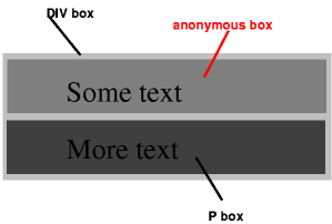
The spec gives an example of anonymous block box generation:
<div>
    Some text
    <p>More text
</p></div>
And states that:
if a block container box (such as that generated for the DIV above) has a block-level box inside it (such as the P above), then we force it to have only block-level boxes inside it.
For example, the spec provides the following illustration of how the example code results in anonymous boxes that wrap the inline-level content:
When an inline box contains an in-flow block-level box, the inline box (and its inline ancestors within the same line box) are broken around the block-level box (and any block-level siblings that are consecutive or separated only by collapsible whitespace and/or out-of-flow elements), splitting the inline box into two boxes (even if either side is empty), one on each side of the block-level box(es). The line boxes before the break and after the break are enclosed in anonymous block boxes, and the block-level box becomes a sibling of those anonymous boxes. When such an inline box is affected by relative positioning, any resulting translation also affects the block-level box contained in the inline box.
In short, when inline-level and block-level boxes are mixed in a single parent element, the inline-level boxes are broken around the block-level box and the inline-level box content is enclosed in an anonymous block-level box.
Anonymous inline boxes
Anonymous inline boxes are generated when a block container element contains text that is not enclosed within an inline-level element. For example, the markup:
<p>Some <em>emphasized</em> text</p>would result in two anonymous inline boxes: one for "Some " and one for " text".
Anonymous box generation is important, because it determines what the formatting context is for elements in normal flow that have both block- and inline-level siblings. Many real-world HTML layouts will have both block- and inline-level content in a single parent element. Anonymous box generation ensures that if any block-level content is mixed in with inline-level siblings, then the inline-level boxes are wrapped in anonymous block-level containers for purposes of layout, which means that they are laid out relative to other boxes as if they were block-level boxes.
Now that we know how the formatting context is determined, let's look at how layout is performed.
Normal flow positioning
In normal flow, the boxes (elements) contained in a particular parent box are laid out based on the formatting context. The two formatting contexts in normal flow roughly correspond to vertical stacking and horizontal stacking.
Normal flow: block formatting
The spec provides a very nice description of how layout works in a block formatting context:
In a block formatting context, boxes are laid out one after the other, vertically, beginning at the top of a containing block. The vertical distance between two sibling boxes is determined by the 'margin' properties. Vertical margins between adjacent block-level boxes in a block formatting context collapse.
In a block formatting context, each box's left outer edge touches the left edge of the containing block (for right-to-left formatting, right edges touch). This is true even in the presence of floats (although a box's line boxes may shrink due to the floats), unless the box establishes a new block formatting context (in which case the box itself may become narrower due to the floats). source
The two most important takeaways are that in a box formatting context, boxes are laid out vertically, and that every box's left outer edge will touch the left outer edge of the containing block (even in the presence of floats).
The code example below illustrates some of these rules:
.float {
  float: left;
}
.foo {
  padding-top: 10px;
}
.bar {
  width: 30%;
}
.baz {
  width: 40%;
}
<div class="container violet">
  <div class="float red">float</div>
  <div class="foo blue">foo</div>
  <div class="bar green">bar</div>
  <div class="baz orange">baz</div>
</div>
In the example above:
- every block box is on the left outer edge of the containing block
- the presence of a float does not influence the position of the left outer edge (per spec) in any way, except to offset the text
- the block box
foo(which has no width set) expands to the full container width - the two other boxes, which have set widths extend from the left edge of the container
- the two other boxes are not moved around in any way, even though they would for example fit on a single row
Overall, the block formatting context is quite regular - it can be described with a couple of paragraphs. However, this is not the case for the inline formatting context.
Normal flow: inline formatting
The inline formatting context is a bit more complicated, as it involves dividing the content onto line boxes, another construct that is not directly visible in the markup but instead generated based on laying out the content:
In an inline formatting context, boxes are laid out horizontally, one after the other, beginning at the top of a containing block. Horizontal margins, borders, and padding are respected between these boxes.
The boxes may be aligned vertically in different ways: their bottoms or tops may be aligned, or the baselines of text within them may be aligned. The rectangular area that contains the boxes that form a line is called a line box. source
The width of a line box is determined by a containing block and the presence of floats. The height of a line box is determined by the rules given in the section on line height calculations.
In short, within an inline formatting context boxes are laid out horizontally onto one or more line boxes. Line boxes are generated as needed; their width is generally the width of the containing block (minus floats) and their height is always sufficient for all the boxes it contains. Specifically:
A line box is always tall enough for all of the boxes it contains. [...] When several inline-level boxes cannot fit horizontally within a single line box, they are distributed among two or more vertically-stacked line boxes. Thus, a paragraph is a vertical stack of line boxes. Line boxes are stacked with no vertical separation (except as specified elsewhere) and they never overlap.
In general, the left edge of a line box touches the left edge of its containing block and the right edge touches the right edge of its containing block. [Line boxes] may vary in width if available horizontal space is reduced due to floats. Line boxes in the same inline formatting context generally vary in height (e.g., one line might contain a tall image while the others contain only text).
What happens when an inline box is too large for a line box? It depends on whether the inline box is replaced (e.g. a video or an image) or non-replaced (text etc.):
When an inline box exceeds the width of a line box, it is split into several boxes and these boxes are distributed across several line boxes. If an inline box cannot be split [...], then the inline box overflows the line box.
When an inline box is split, margins, borders, and padding have no visual effect where the split occurs (or at any split, when there are several).
In other words, when inline boxes exceed the width of a line box, it will be split if possible. When the rules disallow splitting the box, it will simply horizontally overflow the line box.
Perhaps the most complicated aspect of the inline formatting context is how alignment works within line boxes. Two properties: text-align and vertical-align control the alignment.
Horizontal alignment within line boxes: text-align
The text-align property controls how inline-level boxes are positioned on a line box.
| Property | Default value | Purpose |
|---|---|---|
| text-align | a nameless value that acts as 'left' if 'direction' is 'ltr', 'right' if 'direction' is 'rtl' | Describes how inline-level content of a block container is aligned. |
Note that it only applies when the line box contains some unused space, and that you cannot directly control how inline-level content is placed on line boxes. The spec states:
When the total width of the inline-level boxes on a line is less than the width of the line box containing them, their horizontal distribution within the line box is determined by the 'text-align' property. If that property has the value 'justify', the user agent may stretch spaces and words in inline boxes (but not inline-table and inline-block boxes) as well. source
In other words, the text-align property is applied after the inline content has been distributed across line boxes.
A block of text is a stack of line boxes. In the case of 'left', 'right' and 'center', this property specifies how the inline-level boxes within each line box align with respect to the line box's left and right sides; alignment is not with respect to the viewport. In the case of 'justify', this property specifies that the inline-level boxes are to be made flush with both sides of the line box if possible, by expanding or contracting the contents of inline boxes, else aligned as for the initial value. (See also 'letter-spacing' and 'word-spacing'.) source
Normally, whitespace (spaces, tabs etc.) can be affected by justification. However:
If an element has a computed value for 'white-space' of 'pre' or 'pre-wrap', then neither the glyphs of that element's text content nor its white space may be altered for the purpose of justification.
Vertical alignment within line boxes: vertical-align
The following two properties control vertical alignment within line boxes:
| Property | Default value | Purpose |
|---|---|---|
| vertical-align | baseline | Controls the vertical alignment of boxes. Only applies to inline (and table-cell) boxes. |
| line-height | normal (~1.2 times font height) | Specifies the height that is used to calculate line box height. |
vertical-align controls the vertical alignment of inline boxes within line boxes - not the vertical alignment of the line boxes themselves. Of course, to understand how inline boxes are positioned you also need to know how height is calculated both for the line box as well as the inline boxes themselves.
The line box height is determined by two factors:
- the height of the inline boxes contained within it
- the alignment of the inline boxes contained within it
The height of (non-replaced) inline boxes is defined as follows (source):
The 'height' property does not apply. The height of the content area should be based on the font, but this specification does not specify how. A UA may, e.g., use the em-box or the maximum ascender and descender of the font. [...]
The vertical padding, border and margin of an inline, non-replaced box start at the top and bottom of the content area, and has nothing to do with the 'line-height'. But only the 'line-height' is used when calculating the height of the line box.
As you can see from the parts of the spec shown above, the height of inline boxes is determined by their font and their line height. Specifically, each font must define a baseline, a text-top edge and a text-bottom edge. The calculated height of the content area of an inline box is the height of the font (e.g. bottom - top) multiplied by the line-height value:
On a non-replaced inline element, 'line-height' specifies the height that is used in the calculation of the line box height.
line-height can be specified relative to the font height, or it can be set to an absolute length value, in which case the font height is no longer involved in calculating the height of the inline box. It is not at all related to the height of the parent element, even when specified as a percentage.
line-height value |
Description |
|---|---|
| normal | Tells user agents to set the used value to a "reasonable" value based on the font of the element. The value has the same meaning as <number>. We recommend a used value for 'normal' between 1.0 to 1.2. The computed value is 'normal'. |
<length> |
The specified length is used in the calculation of the line box height. Negative values are illegal. |
<number> |
The used value of the property is this number multiplied by the element's font size. Negative values are illegal. The computed value is the same as the specified value. |
<percentage> |
The computed value of the property is this percentage multiplied by the element's computed font size. Negative values are illegal. |
What happens if more than one font is used within a single inline box?
If more than one font is used (this could happen when glyphs are found in different fonts), the height of the content area is not defined by this specification. However, we suggest that the height is chosen such that the content area is just high enough for either (1) the em-boxes, or (2) the maximum ascenders and descenders, of all the fonts in the element. [...]
The spec does not define the value, but the recommendation is that it is large enough for all fonts used (e.g. the maximum among the font heights).
The alignment of the inline boxes is determined by the vertical-align property. There are two sets of values, the first set being relative to the parent's font baseline, content area, or font-defined positions such as sub and super.
vertical-align value |
Description |
|---|---|
| baseline | Align the baseline of the box with the baseline of the parent box. If the box does not have a baseline, align the bottom margin edge with the parent's baseline. |
| middle | Align the vertical midpoint of the box with the baseline of the parent box plus half the x-height of the parent. |
| sub | Lower the baseline of the box to the proper position for subscripts of the parent's box. |
| super | Raise the baseline of the box to the proper position for superscripts of the parent's box. |
| text-top | Align the top of the box with the top of the parent's content area (see 10.6.1). |
| text-bottom | Align the bottom of the box with the bottom of the parent's content area (see 10.6.1). |
<percentage> |
Raise (positive value) or lower (negative value) the box by this distance (a percentage of the 'line-height' value). The value '0%' means the same as 'baseline'. |
<length> |
Raise (positive value) or lower (negative value) the box by this distance. The value '0cm' means the same as 'baseline'. |
The second set of values are defined relative to the parent's line box, which itself is defined by the vertical-align of other elements. This is a recursive definition, since the height of the line box depends on the vertical alignment and the vertical alignment depends on the line box height. This means that boxes with these special values are positioned only after the line box height has been calculated based on the inline box sizes and alignments defined earlier. These two values for vertical-align are:
vertical-align value |
Description |
|---|---|
| top | Align the top of the aligned subtree with the top of the line box. |
| bottom | Align the bottom of the aligned subtree with the bottom of the line box. |
To recap, inline boxes have:
- a font size, which determines the size of the text glyphs
- a line height, which determines the height of the inline box (in absolute terms or relative to the font size)
- a baseline, which is a position defined by the font, and on which the bottom edges of most glyphs / characters are aligned (excluding characters such as q and g, which have descenders/ascenders - parts that extend below/above the baseline alignment)
The line box height is calculated after calculating the heights of every inline box in it, and then applying all vertical-align alignments other than vertical-align: top and vertical-align: bottom.
Each line box has:
- a font size, which is inherited from the parent
- a height defined by the heights and alignments of inline boxes in the line box
- a baseline, which is defined by a "strut" (except in rare cases involving
vertical-align: top/bottom): an invisible, zero-width inline box with the element's font and line height properties
Typically, the font size of the parent and child elements are the same, so you cannot see the difference between the baseline of the line box and the baseline of the child inline boxes. However, here is an illustration of how vertical alignment works in a somewhat complicated case:
.parent {
  font-size: 48pt;
  border: 1px solid black;
  float: left;
}
.child {
  font-size: 12pt;
  vertical-align: baseline;
}
.super {
  font-size: 12pt;
  vertical-align: super;
}
<div class="parent">
  <span class="child">child
    <span class="super">sup
      <span class="super">sup</span>
    </span> here
  </span>
  <span class="super">sup-parent</span>
</div>
<div class="parent">aA</div>
In the example above:
- even though the first parent element does not contain any text by itself, the baseline and the minimal line height of the line boxes inside that parent element is defined by the font size set on the parent element.
- The first child element's baseline is aligned with the parent's baseline. The parent's baseline is based on the font size set on the parent element even though the parent contains no text that uses that font size. This is the "strut" mechanism in action, where the parent baseline is defined by an invisible, zero-width inline box with the element's font and line height properties.
- Next, a series of
vertical-align: superinline elements gradually shift the baseline, which could increase the line height further (in this case it does not because the parent font is so large). This illustrates how alignment can increase line box height. - Finally, the span with "super-parent" is on the same level as the first "child" element, so its baseline is shifted according to the parent's font size's
superposition, which appears much higher than the other two super -aligned inline elements because the parent font size larger than the child font size.
Note that many of the vertical-align values are relative to the parent element's baseline - which is determined by the font metrics and font size of the parent element. For example, the chain of vertical-align: super elements gradually shifts the baseline upwards.
Note that tables also have a vertical-align property, but it works differently in the context of tables.
The next example illustrates how the inline-block vertical centering technique works (based on this page). The inline-block centering technique is one of many methods that allow you vertically (and horizontally) center an element. Because it uses an inline formatting context and the vertical-align property, it provides a good practical example of how these properties are used.
.container {
  text-align: center;
  overflow: auto;
  height: 120px;
}

.container:after,
.block {
  display: inline-block;
  vertical-align: middle;
}

.container:after {
  content: '';
  height: 100%;
  margin-left: -0.25em; /* To offset spacing. May vary by font */
  width: 10px; /* to show the inserted pseudo element */
  background-color: lightgreen; /* to show the inserted pseudo element */
}

.block {
  max-width: 99%; /* Prevents issues with long content causes the content block to be pushed to the top */
}
<div class="container blue">
  <div class="block red">Centered</div>
</div>
I've added a couple of additional styles to better show the different parts that allow this technique for vertical centering to work. As you can see in the example above:
- the inner blocks inside the container are
display: inline-block, meaning they are treated as inline-level boxes and produce an inline formatting context, but their contents behave likedisplay: blockelements (for example, settingwidth: 100%works!). - the container has
text-align: centerto cause the inline-level blocks to be centered on each line box. - the content block has
vertical-align: middleset on it, which aligns it vertically relative to all the other content on the line box. - a pseudo-element with
height: 100%is added to the end of the container. It is shown in green. This is necessary because without it, the content block would simply be positioned at the top of the flow, because it would exist on its own on a single line box, and the line box height would simply match the content block, which would mean that there would be nothing to align it with. - the
margin-left: -0.25emis simply a heuristic to offset the spacing caused by the pseudo element.
In short, the reason why this centering technique works is because we have forced the line height of the container to be 100% percent of the parent height, and then have asked for the centered item to be positioned at the midpoint of the sibling (green) element. Assuming that the box to be centered is less wide than the container, all of this will be placed on a single, very tall line box and the end result is vertical and horizontal centering.
The last example illustrates an additional interaction where anonymous box generation can cause problems with the distribution of inline-level boxes onto line boxes:
.half {
  display: inline-block;
  width: 50%;
  border-width: 0;
}
<div class="blue">
  <div class="half green">width: 50%</div>
  <div class="half orange">width: 50%</div>
</div>
In the example above:
- the two divs are sized to
width: 50%, however, they are wrapped on to two lines. - The problem here is that the whitespace between the two divs causes an anonymous inline box to be generated. With the anonymous inline box, the contents of the line box add up to more than 100% of the available width of the parent, causing a second line box to be created.
There are a couple of solutions to this problem:
- one way to fix this is to eliminate the whitespace between the two divs, e.g.
...</div><div>.... - another way to solve this is to set font-size to 0 in the parent layer, and then to set it to the value you want in the two child divs. This should cause the whitespace to not take up any space.
- Setting
white-space: nowrapalso helps - it doesn't get rid of the whitespace, but it does prevent line breaking due to whitespace. In this case, the two divs would be positioned on the same line box, but with a space in between, and the right div would overflow the parent container. - finally, the CSS3
text-space-collapseproperty, which is currently not implemented by most browsers will address this issue.
vertical-align: middle doesn't quite do what you'd expect
Another point I realized fairly late in my writing process is that vertical-align: middle doesn't actually align elements to the middle of the parent container box as you might expect.
As you may remember, the spec says:
middle: Align the vertical midpoint of the box with the baseline of the parent box plus half the x-height of the parent
But what does that actually mean? Let's decode:
- align the vertical midpoint of the (child, inline-level) box: this seems fine
- with baseline of the parent box: this means that the parent font metrics play a role in the positioning
- plus half the x-height of the parent: what is
x-height?
Putting these pieces together took a while. First, x-height is not the same thing as the height of the parent box. Instead, it is defined in section 4.3.2 of the spec as:
The 'x-height' is so called because it is often equal to the height of the lowercase "x". However, an 'ex' is defined even for fonts that do not contain an "x".
The x-height of a font can be found in different ways. Some fonts contain reliable metrics for the x-height. If reliable font metrics are not available, UAs may determine the x-height from the height of a lowercase glyph. One possible heuristic is to look at how far the glyph for the lowercase "o" extends below the baseline, and subtract that value from the top of its bounding box. In the cases where it is impossible or impractical to determine the x-height, a value of 0.5em should be used.
So, an x-height is literally the height of an x character in the font rather than half the height of the parent element.
Now, when the spec says "parent box", what does that mean? It turns out that they mean the line box, not the container box which establishes the inline formatting context. Let me illustrate:
.parent {
  height: 60px;
  font-family: monospace;
}
.child {
  font-size: medium;
  vertical-align: middle;
}
<div class="parent blue">
x
<span class="child green"><</span>
</div>
As you can see above, the child is aligned with the line boxes x-height, not the parent element's height. Since the line only contains the span plus generated anonymous inline-level boxes for the whitespace, its height matches the line-height of the font, and nothing happens. In fact, since we are talking about x-height rather than height, the height of the line box doesn't even matter. The next example illustrates:
.parent {
  height: 60px;
  font-family: monospace;
}
.parent2 {
  height: 60px;
  font-family: monospace;
  font-size: 40px;
}
.large {
  font-size: 40px;
}
.child {
  font-size: medium;
  vertical-align: middle;
}
<div class="parent blue">
x
<span class="child green"><</span>
<span class="large green"><</span>
</div>
<div class="parent2 blue">
x
<span class="child green"><</span>
<span class="large green"><</span>
</div>
If you compare the two boxes in the example:
- in the first example, the alignment between the first
<and thexappears to be exactly the same as before even though the line box height is now much greater due to the second<. - in the second example, the height of the line box is the same as before. However, I also increased the font size of the parent. This causes both the baseline of the parent box to move and also increases the
x-height(literally, the height of an x in the parent's font). As you can see, the position of the first<finally changes.
The short version of this is that vertical-align: middle really means "place the child element above the baseline of the parent element at half the height of an x character in the parent font" - not "middle" in almost any circumstance. This is a very font-centric view of the world: it's not the middle of the parent element and not even the middle of the line box that the child element resides on. While vertical-align: middle often looks fine, pedantically speaking it's not the middle of anything other than an x-glyph in the parent font.
Normal flow: relative positioning
Now that we've discussed both the block formatting context and the inline formatting context, it's time to take a look at the last normal flow positioning property value: position: relative.
Relative positioning is considered to be part of the normal flow, since it does not differ substantially from normal flow.
relative: The box's position is calculated according to the normal flow [...]. Then the box is offset relative to its normal position. When a box B is relatively positioned, the position of the following box is calculated as though B were not offset. The effect of 'position:relative' on table-row-group, table-header-group, table-footer-group, table-row, table-column-group, table-column, table-cell, and table-caption elements is undefined. source
In other words, relatively positioned elements are positioned as normal, then offset from their normal position based on the top, left, bottom and right property values.
.float {
  float: left;
}
.foo {
  padding-top: 10px;
}
.bar {
  position: relative;
  top: -20px;
  left: 10px;
  width: 30%;
}
.baz {
  width: 40%;
}
<div><div class="float red">float</div><div class="foo blue">foo</div><div class="bar green">bar</div><div class="baz orange">baz</div></div>
As you can see in the example:
- the
.barbox is offset 20 pixels up from its normal flow position because it hastop: -20px - the subsequent
.bazbox is still positioned as if the.barbox was in its original position in the normal flow
Float positioning scheme
The float positioning scheme was intended for wrapping text around images, but it has become a basic building block for many - if not most - modern CSS grid frameworks. Floats become a lot easier once you understand how normal flow works and how inline formatting contexts are split into line boxes. Setting the float property causes an element's box to be positioned using the float positioning scheme.
| Property | Default value | Purpose |
|---|---|---|
| float | none | Allows other elements to float around the element |
Floats can be described as being block-level-like elements which are taken out of the normal flow during layout. They do not affect block-level boxes, but can affect the line boxes contained within block-level boxes. Here's how the spec defines them:
A float is a box that is shifted to the left or right on the current line. The most interesting characteristic of a float (or "floated" or "floating" box) is that content may flow along its side (or be prohibited from doing so by the 'clear' property). Content flows down the right side of a left-floated box and down the left side of a right-floated box.
Floats exhibit several special behaviors:
- Floats are taken out of the normal flow during layout, and hence they do not affect the vertical positioning of block-level elements.
- Floats are aligned to either the left or right outer edge of their container.
- Floats are stacked starting from either the left or right edge, and are stacked in the order they appear in markup. In other words, for right-floated boxes, the first right-floated box is positioned on the right edge of the box that contains it and the second right-floated box is positioned immediately left of the first box. source
- Floats can, however, affect the current and subsequent elements' inline-level content's line boxes. Specifically, any current and subsequent line boxes are shortened to make space for the float.
- Because floats are not in the normal flow, they do not normally affect parent height. This is one reason why the "clearfix" technique was developed.
- Floats can be cleared using the
clearproperty.
Let's go through the specifics of each of these behaviors along with a couple of illustrative code examples.
Floats are positioned on the outer edge of their containing block, or if there are other floats, on the outer edge of the preceding float:
A floated box is shifted to the left or right until its outer edge touches the containing block edge or the outer edge of another float. If there is a line box, the outer top of the floated box is aligned with the top of the current line box.
Floats stack in the order they were defined in markup:
If the current box is left-floating, and there are any left-floating boxes generated by elements earlier in the source document, then for each such earlier box, either the left outer edge of the current box must be to the right of the right outer edge of the earlier box, or its top must be lower than the bottom of the earlier box. Analogous rules hold for right-floating boxes. source
The following example illustrates this behavior:
.left {
  float: left;
}
.right {
  float: right;
}
<div class="left red">A</div>
<div class="right blue">B</div>
<div class="left red">C</div>
<div class="right blue">D</div>
<div class="left red">E</div>
<div class="right blue">F</div>
In the example above:
- The divs are ordered alphabetically in markup (A, B, C, D, E, F)
- The first, 3rd and 5th divs have
float: leftand the second, 4th and 6th divs havefloat: right. - All divs stacked in markup order, with the first left or right floated div taking the leftmost or rightmost position and so on.
Floats that would not fit horizontally are shifted downward:
If there is not enough horizontal room for the float, it is shifted downward until either it fits or there are no more floats present.
Floats are ignored for the purpose of vertically positioning block boxes in the same flow. However, floats can affect the line boxes contained within block boxes in normal flow:
Since a float is not in the flow, non-positioned block boxes created before and after the float box flow vertically as if the float did not exist. However, the current and subsequent line boxes created next to the float are shortened as necessary to make room for the margin box of the float.
The following example illustrates this behavior:
.float {
  float: left;
  height: 500px;
}
.para {
  margin: 0;
}
<div class="para blue">Text inside a block-level box placed on a line box before the float</div>
<div class="para green">Text before the float. <div class="float red">The float</div> Text after the float.</div>
<div class="para orange">Text inside a block-level box placed on a line box after the float</div>
In the example above:
- All of the block-level divs (
.para) are vertically positioned as if they were in a block formatting context on their own. - The float influences the current and subsequent line boxes, but not the line boxes of the first block-level div because it precedes the float.
- It is worth noting that I did not use
ptags for the paragraphs, because they would be interpreted differently and would produce a different rendering. This is not because of CSS, but because HTML disallowsdivs (like the float) insideptags and browser error correction behavior will result in a different corrected markup and rendering.
Floats do not affect the line boxes inside elements in normal flow that establish new block formatting contexts. Instead, such elements are either placed to the side of the float, or cleared by placing them below any preceding floats:
The border box of a table, a block-level replaced element, or an element in the normal flow that establishes a new block formatting context (such as an element with 'overflow' other than 'visible') must not overlap the margin box of any floats in the same block formatting context as the element itself. If necessary, implementations should clear the said element by placing it below any preceding floats, but may place it adjacent to such floats if there is sufficient space.
The following example illustrates this behavior:
.float {
  float: left;
  height: 500px;
}
.para {
  margin: 0;
}
.new-context {
  margin: 0;
  overflow: auto;
}
<div class="para blue">before</div>
<div class="float red">The float</div>
<div class="new-context green">new formatting context<br>foo bar</div>
<div class="para orange">after</div>
In the example above:
- The
new-contextdiv establishes a new formatting context (e.g. because itsoverflowis notvisible). - The float that precedes that div does not affect the line boxes of
new-context. As you can see, the border ofnew-contextis next to the border of the float, and thenew-contextbox is placed next to the float. - The float does affect the line boxes of the following div, because it does not establish a new block formatting context. The left border of the div containing "after" is drawn underneath the float.
It turns out that this behavior is quite useful and practically important - most CSS grid frameworks make use of floats and an overflow value other than visible for layout.
Float clearing
The CSS specification allows you to prevent floats from interacting with subsequent elements' line boxes by setting the clear property (source).
| Property | Default value | Purpose |
|---|---|---|
| clear | none | Specifies whether an element can be next to floating elements that precede it or must be moved down (cleared) below them |
The clear property can take one of the following values:
left: Requires that the top border edge of the box be below the bottom outer edge of any left-floating boxes that resulted from elements earlier in the source document.right: Requires that the top border edge of the box be below the bottom outer edge of any right-floating boxes that resulted from elements earlier in the source document.both: Bothfloat: leftandfloat: rightmust be cleared as abovenone: No constraint on the box's position with respect to floats.
The following example illustrates:
.left, .right {
  width: 35%;
  height: 40px;
}
.left {
  float: left;
}
.right {
  float: right;
}
.clear-left {
  clear: left;
}
.clear-both {
  clear: both;
}
<div class="left blue">A</div>
<div class="left blue">B</div>
<div class="right red">C</div>
<div class="right red">D</div>
<div class="clear-left orange">Clear left only. Clear left only. Clear left only. Clear left only. Clear left only. Clear left only.</div>
<div class="left blue">E</div>
<div class="left blue">F</div>
<div class="right red">G</div>
<div class="right red">H</div>
<div class="clear-both violet">Clear both. Clear both. Clear both. Clear both. Clear both. Clear both. Clear both.</div>
Another potentially surprising property of floats is that they are not taken into account when calculating the height of the parent! If there are no other elements in the parent element, then the parent element will have a height of zero. The example below illustrates:
.left {
  float: left;
  width: 35%;
  height: 40px;
}
<div class="orange">
  <div class="left blue">A</div>
  <div class="left blue">B</div>
  <div class="left red">C</div>
  <div class="left red">D</div>
</div>
The reason behind this is that there are actually two variants of "content-based" height calculation, and the one that is used for block-level elements with overflow: visible (the default value) does not take into account floats when determining the height of the parent. Setting overflow to any other value, or explicitly clearing the floats would cause the parent height to be computed so that the floats are taken into account. The next chapter covers the box model size calculations in much more depth.
The clearfix
The clearfix technique is an enhancement over basic float clearing. The clearfix is a small piece of CSS that is used by many developers who work with floats. Over the years, there have been several different versions of the clearfix - the modern versions are less terrible since they contain fewer old, IE-specific fixes.
A clearfix combines several desirable properties into one class:
- it prevents the floats within the clearfixed parent element from affecting line boxes in other elements that follow the clearfixed element
- it causes the floats within the clearfixed parent element to be taken into account when calculating that element's height
For example, given the following markup - where no clearfix is active:
.left {
  float: left;
  width: 15%;
  height: 40px;
}
<div class="row clearfix blue">
  <div class="left blue">A</div>
  <div class="left blue">B</div>
</div>
<div class="row clearfix green">
  <div class="left green">C</div>
  <div class="left green">D</div>
</div>
<div class="row clearfix orange">
  <div class="left orange">E</div>
  <div class="left orange">F</div>
</div>
... we'd like the floats to form individual rows within their parents.
There are three ways to accomplish this:
- explicitly adding an element with
clear: bothat the end of the parent - adding an element with
clear: bothusing pseudo-elements at the end of the parent - making the parent element establish a new formatting context using a property such as
overflow: hiddenoroverflow: auto
The example in the section on clearing floats illustrated the first approach: explicitly adding an element which clears floats will prevent the floats from interacting with subsequent elements. However, explicitly adding an element into markup to achieve a particular layout is bad - it breaks the contract that the markup should not be concerned with layout.
Instead of explicitly adding an element, we can use the :after pseudo element to insert additional content at the end of the .clearfixed div. Here's what a basic clearfix following that pattern would look like:
.clearfix:after {
  content: "";
  display: table;
  clear: both;
}
.left {
  float: left;
  width: 15%;
  height: 40px;
}
<div class="clearfix blue">
  <div class="left blue">A</div>
  <div class="left blue">B</div>
</div>
<div class="clearfix green">
  <div class="left green">C</div>
  <div class="left green">D</div>
</div>
<div class="clearfix orange">
  <div class="left orange">E</div>
  <div class="left orange">F</div>
</div>
Finally, making the .clearfixed element establish a new formatting context - by setting the overflow value to something other than visible - also works. This also affects how the automatic height of the element is calculated (see details in the next chapter), so that floats are taken into account when calculating height:
.clearfix {
  overflow: auto;
}
.left {
  float: left;
  width: 15%;
  height: 40px;
}
<div class="clearfix blue">
  <div class="left blue">A</div>
  <div class="left blue">B</div>
</div>
<div class="clearfix green">
  <div class="left green">C</div>
  <div class="left green">D</div>
</div>
<div class="clearfix orange">
  <div class="left orange">E</div>
  <div class="left orange">F</div>
</div>
Which technique should you use? The first, pseudo-element based technique is more common, because it avoids issues with element overflow. Setting overflow to something other than visible may cause content to be clipped and may cause scrollbars to appear. The example below illustrates:
.clearfix-overflow {
  overflow: auto;
}
.clearfix-pseudo:after {
  content: "";
  display: table;
  clear: both;
}
.left {
  float: left;
  width: 15%;
  height: 40px;
}
.offset-1 {
  position: relative;
  top: 15px;
}
.offset-2 {
  position: relative;
  top: 30px;
}
<div class="clearfix-overflow blue">
  <div class="left blue">A</div>
  <div class="left offset-1 blue">B</div>
  <div class="left offset-2 blue">C</div>
</div>
<br>
<div class="clearfix-pseudo green">
  <div class="left green">D</div>
  <div class="left offset-1 green">E</div>
  <div class="left offset-2 green">F</div>
</div>
In this example, the floated blocks are also offset from the top so that they overflow their container box.
The first row uses the overflow: auto fix to cause the parent element establish a new formatting context. However, as a side effect, it also alters how overflow works, causing overflowing content to be scrollable rather than visible.
The second row uses the pseudo-element approach, which adds a pseudo element with clear: both at the end of the row. This keeps the default overflow: visible value, which means that the overflowed floats are still visible.
Absolute / fixed positioning scheme
The absolute / fixed positioning scheme is the last positioning scheme. It is fairly simple to describe: boxes are positioned in terms of an absolute offset with respect to the containing block.
Absolutely positioned elements are ignored for purposes of calculating normal flow positioning, and do not interact with sibling floating elements. They have no impact on the layout of later siblings. Floats contained in absolutely positioned elements only interact with elements within that absolutely positioned element.
As the spec states:
In the absolute positioning model, a box is explicitly offset with respect to its containing block. It is removed from the normal flow entirely (it has no impact on later siblings). An absolutely positioned box establishes a new containing block for normal flow children and absolutely (but not fixed) positioned descendants. However, the contents of an absolutely positioned element do not flow around any other boxes. They may obscure the contents of another box (or be obscured themselves), depending on the stack levels of the overlapping boxes. source
There are two values of the position property which trigger absolute positioning, position: absolute and position: fixed. The spec defines them as:
absolute: The box's position (and possibly size) is specified with the 'top', 'right', 'bottom', and 'left' properties. These properties specify offsets with respect to the box's containing block. Absolutely positioned boxes are taken out of the normal flow. This means they have no impact on the layout of later siblings. Also, though absolutely positioned boxes have margins, they do not collapse with any other margins. source
fixed: The box's position is calculated according to the 'absolute' model, but in addition, the box is fixed with respect to some reference. source
Fixed positioning is relative to the viewport, while absolute positioning is relative to the containing block.
The exact positioning of such boxes is based on the width, height, top, left, bottom and right properties. If these values are explicitly set, then positioning is quite straightforward. However, if the values are partially specified, then the computations become much more complicated.